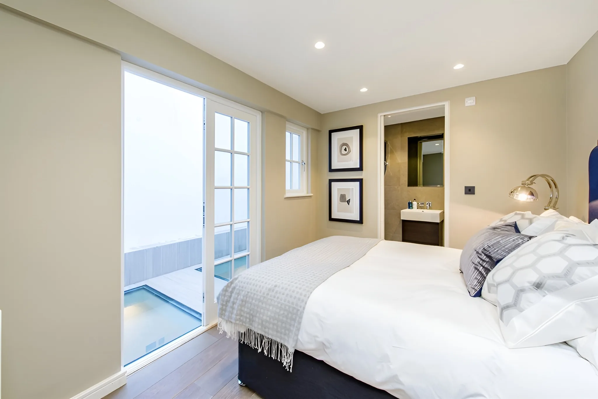
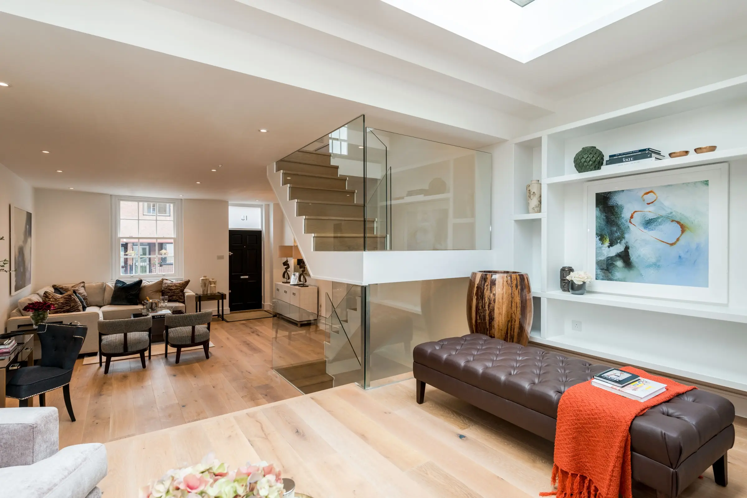
Volck — 20 More Design Directions
A second set of 20 directions exploring territory not covered in the first set — from Neobrutalism and Maximalism to Hotel/Hospitality crossover, Print Catalogue, and Glassmorphism.
21Neobrutalism
The dominant web design trend of 2024–25 — thick black borders, offset drop shadows, flat colour fills on off-white. Chunky Outfit typeface at heavy weights. Common in tech and startup world, completely absent from luxury interiors. That absence is the opportunity. The yellow accent reads as bold without being garish — it's the chicest version of the trend.
FontOutfit 700 — geometric, punchy, modern grotesque. Very different from any interiors peer.
Layout50/50 hard split with 3px border rule. Nav as bordered button row. Offset box-shadow card.
Palette#f5f0e8 warm off-white, #1a1a1a black, #f0c040 yellow — three colours only
ToneConfident and irreverent. Doesn't ask permission. "INTERIORISM" as a single proud noun.
TacticBorrow energy from tech/startup culture — the place where the next generation of UHNW clients comes from.
UXInstant legibility. High contrast forces the eye. No ambiguity about what anything is.
INTER
IOR
ISM.
Bespoke residential design for people who know their own mind. London and beyond.
WorkStudioProcessTalk
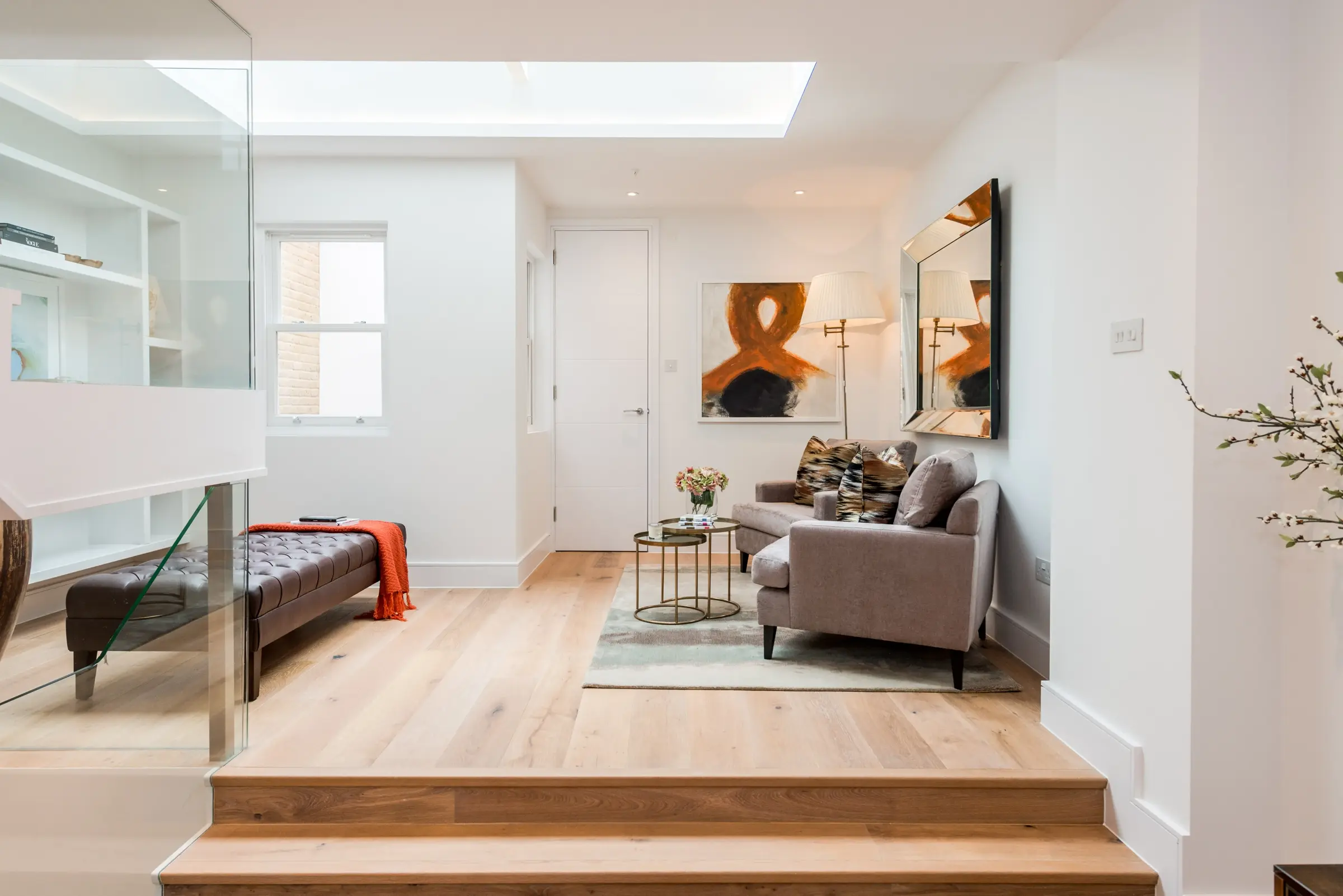
↗ Latest — Broadley Street
22Maximalist / Dopamine
Direct response to the "Dopamine Decorating" interior trend — rich, saturated, joyful. Multi-colour headline in Bodoni italic, layered gradient backgrounds, split image panels. The anti-minimalism. Works as a brand positioning for a studio that designs colour-positive, expressive interiors — not for clients wanting beige. Highly memorable and shareable on social.
FontBodoni Moda italic 700 — maximum high-contrast serif drama. Multi-colour headline treatment.
Layout50/50 split. Left: gradient bg + type. Right: 2-row stacked images with colour overlay.
Palette#1a0a2e deep purple, #ff3c78 pink, #3c64ff blue, #f0c040 gold — full chromatic spectrum
ToneJoyful and bold. The headline itself is the personality — colour as language.
TacticOwn the Maximalist territory while every competitor is still fighting over minimalism.
UXImmediate visual impact. The chromatic hit is the first impression — qualify visitors instantly.
Volck Interiors
Bold.Considered.Yours.
ProjectsStudioContact
23Scandinavian / Nordic
The Kinfolk magazine aesthetic applied to an interiors studio — Albert Sans at ultra-light weight, generous negative space, photography desaturated to near-monochrome. Warm off-white rather than cold white. Different from Japanese minimalism (06) — this is warmer, more domestic, more hygge. References Scandinavian furniture houses like Hay, Muuto, and Vipp. Very strong for a studio with Scandi-influenced design sensibility.
FontAlbert Sans 200 — ultra-light Nordic grotesque. Almost disappears at body size. That's the point.
Layout50/50 split. Left: text with extreme breathing room. Right: stacked images 2:1 ratio.
Palette#f4f1ec warm oat, #2c2c2c near-black, #999 mid-grey — warm Scandinavian neutrals
ToneCalm, functional, considered. No superlatives. "Bespoke residential design" — that's enough.
TacticNorthern European design intelligence. For clients who know their Alvar Aalto from their Arne Jacobsen.
UXVery low visual noise. Unhurried. Invites the visitor to slow down and look carefully.
Volck
Simple.
Resolved.
Enduring.
Residential interiors designed to last longer than the trend that inspired them. London and beyond.
Est. London — Nine Projects
ProjectsAboutContact
24Hotel / Hospitality Crossover
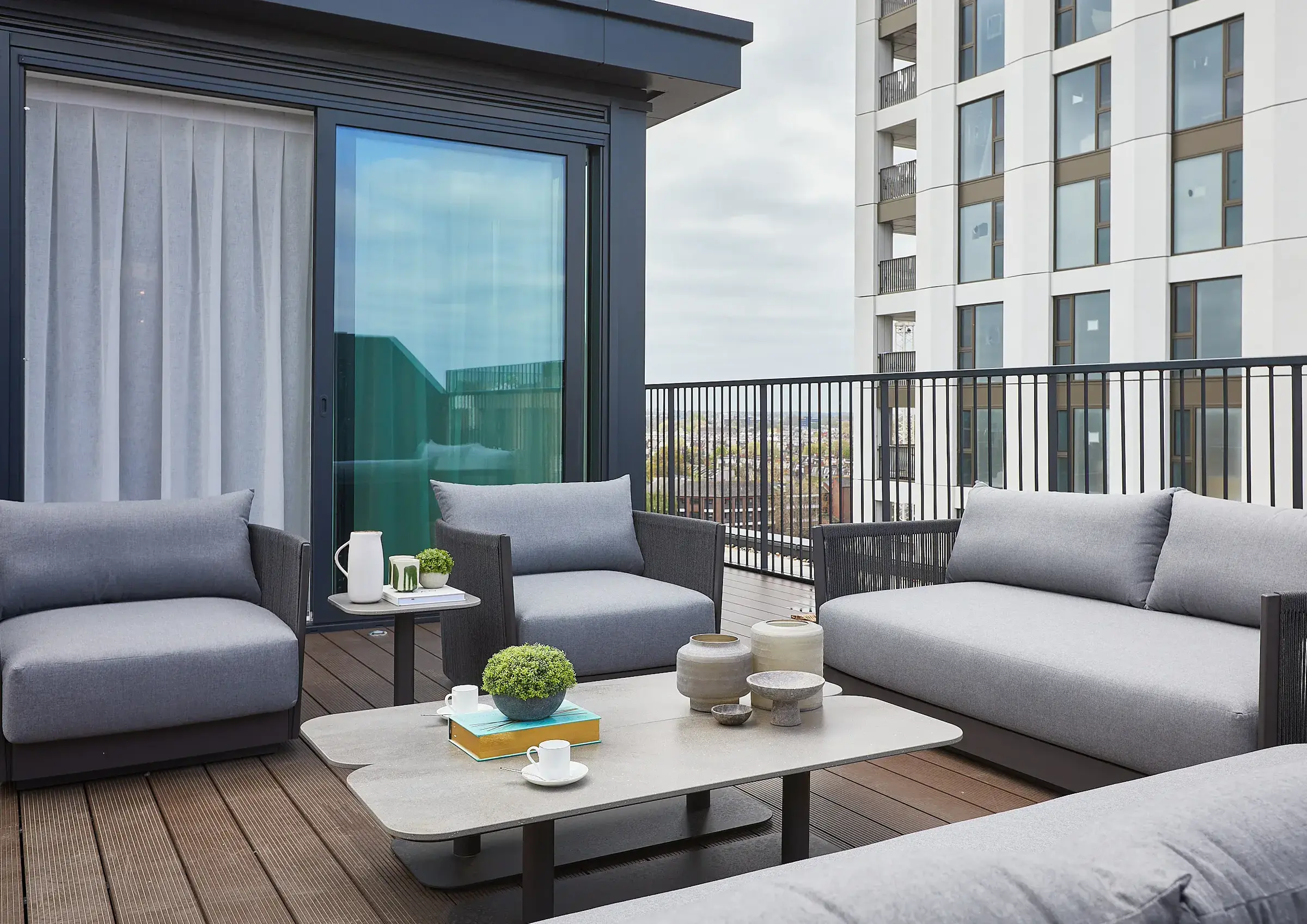
Borrows directly from the visual language of ultra-luxury hotel brands — Aman, Rosewood, Six Senses. Three equal panels with full-bleed photography, room-type style labelling, Cormorant italic project names. Raleway ultra-light UI. The idea: present Volck projects as if they were hotel suites available to experience. Positions residential design as a curated lifestyle offering, not just a service.
FontRaleway 100–200 for all UI, Cormorant Garamond italic for project names — featherlight hospitality
LayoutThree equal full-height panels. Each: full-bleed image, suite-label, italic project name, location.
Palette#0e0e0e near-black, photography at 55% opacity, no accent — photography provides all warmth
ToneHushed, experiential. Label language ("Suite 01") treats the home like a destination.
TacticHospitality sector branding applied to residential design. Elevates the category perception entirely.
UXHover reveals opacity shift. Three projects visible simultaneously — instant portfolio overview.
PortfolioStudioContact
Suite 01
Chelsea Penthouse
42 Savoy House, SW3
Suite 02
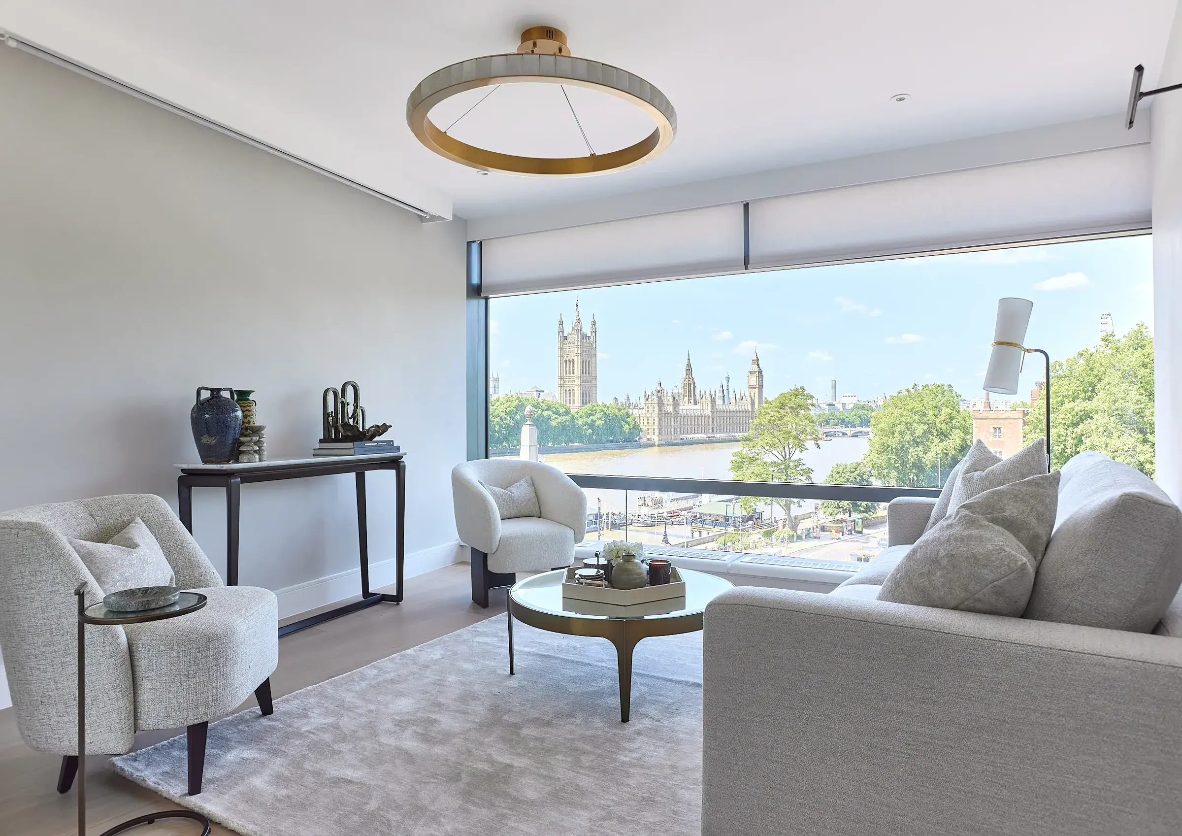
Westminster Apartment
Parliament View, SW1
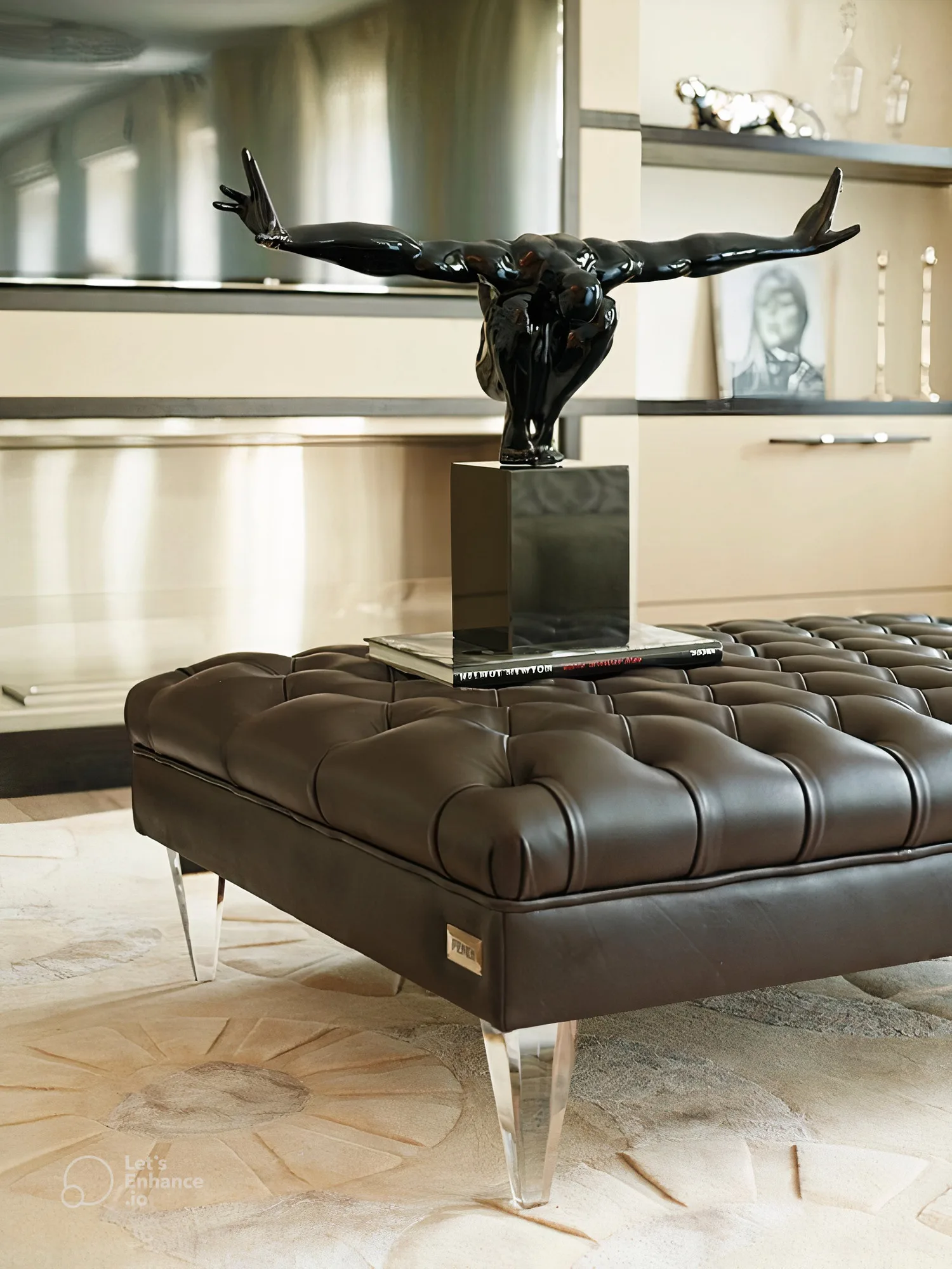
Suite 03
Harrods Court
Knightsbridge, SW1
25English Country House
Deep heritage aesthetic — rich espresso brown left panel with subtle cross-hatch pattern, Cinzel Roman serif, antique gold accents. References the visual world of English country estates, auction houses and heritage brands (Colefax & Fowler, George Spencer). Works exceptionally well for a studio whose client base includes period London houses and country properties. Positions Volck in a centuries-old tradition of English interior craft.
FontCinzel 400/600 — Roman inscription-inspired. EB Garamond italic for body. Maximum heritage.
Layout380px dark left sidebar with pattern texture. Right: 2-row stacked images with caption overlays.
Palette#2a1f14 espresso, #e8d5b0 antique cream, #c9a84c gold — English heritage triad
ToneFormal and assured. "Every great room begins with a conversation." Classical copy register.
TacticHeritage positioning — signals deep roots in English decorating tradition. Trust-building for period property clients.
UXVertical nav on left sidebar. Ritual entry — the dark panel frames the photography like a doorway.
Volck
Every great room begins with a conversation, and ends with somewhere worth returning to.
PortfolioThe StudioCommissionsContact
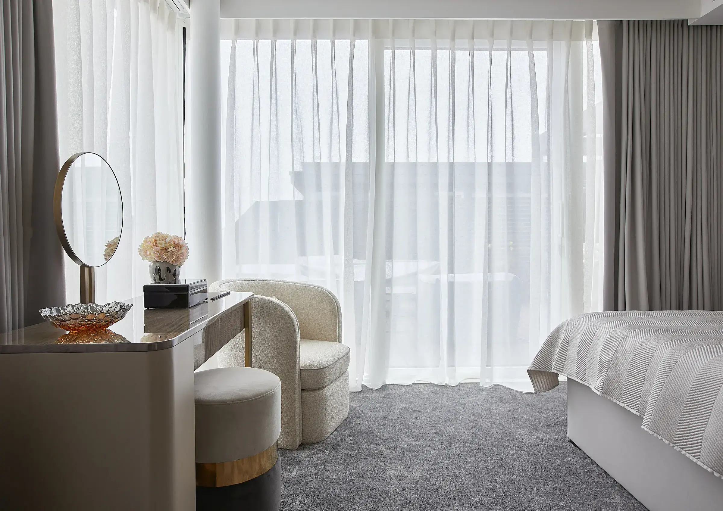
Chelsea Penthouse
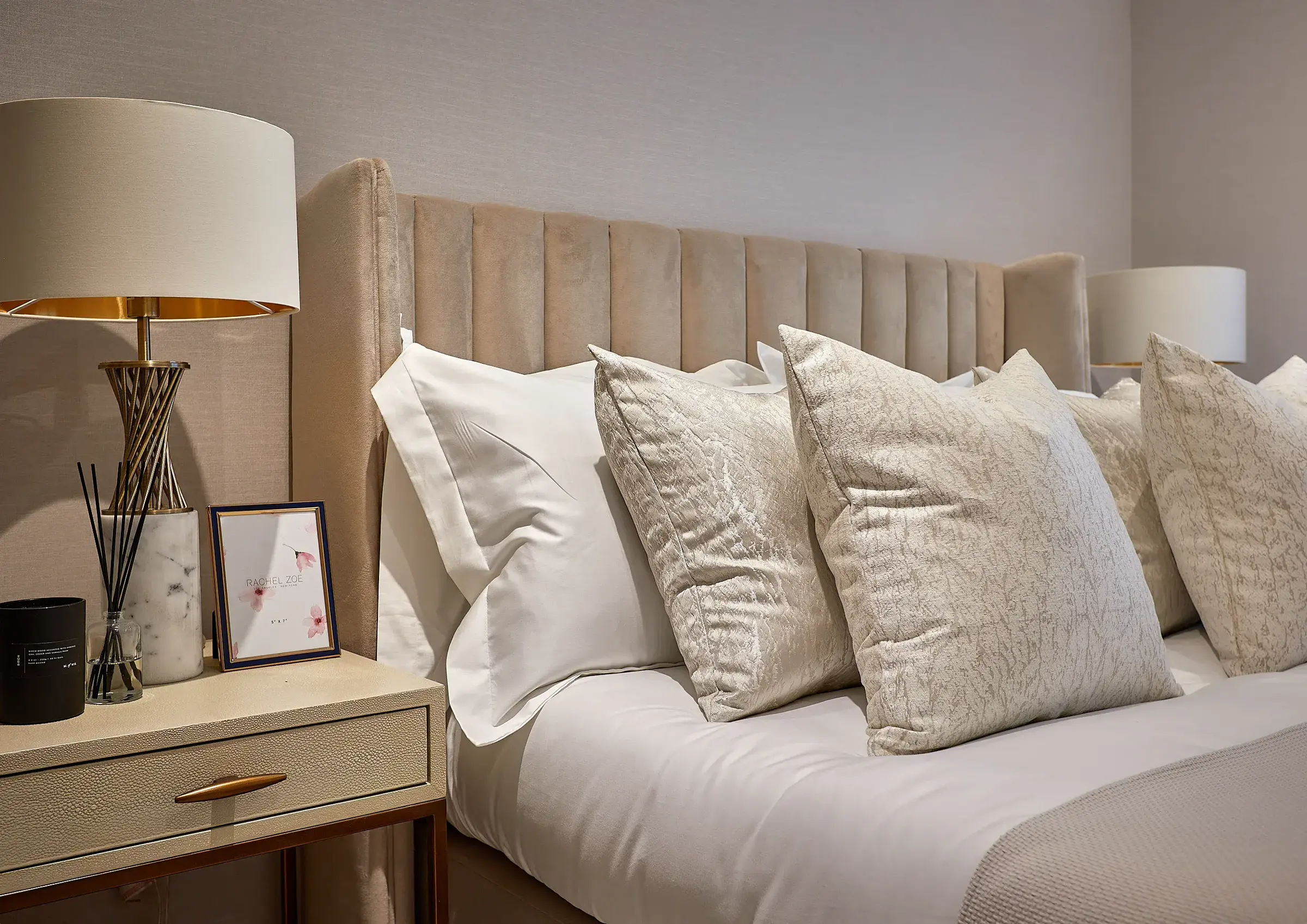
Kingston Apartment
26Mediterranean / Coastal
Terracotta, cerulean and bleached linen tones — the palette of Positano, Marrakech and the Côte d'Azur. Crimson Pro at light weight as a warm humanist serif. The terracotta red accent provides energy without aggression. Works especially well for a studio with international clients or projects outside London. The photography warmth reads differently against this palette — sunlit and aspirational rather than grey and considered.
FontCrimson Pro 300 italic — warm humanist serif with Mediterranean warmth. Different from British peers.
Layout50/50 split. Full-bleed photography left with colour overlay. Text column right with generous padding.
Palette#f5f0e6 bleached linen, #2a2018 dark earth, #b84830 terracotta — Mediterranean triad
ToneWarm and poetic. "Sun-lit. Considered. Yours." Evokes place as much as space.
TacticInternational lifestyle positioning. For clients with properties across climates and cultures.
UXPhotography leads with emotional warmth. The terracotta accent draws the eye to the detail line.
Volck
Warm.
Considered.
Enduring.
Residential interiors designed with the light and life of the people who live in them. London and beyond.
ProjectsStudioContact
27Print Catalogue / Lookbook
Simulates a high-end printed catalogue — crop marks in all four corners, page numbers, folio line at the bottom, Bodoni Moda masthead with horizontal rule. References the visual world of Taschen books and fashion house lookbooks. Completely breaks the convention of "website" — the frame says this is an object, not a page. Strong for a studio that produces printed materials or has a luxury gifting practice.
FontBodoni Moda 400 for headline/logo, EB Garamond italic for captions — traditional print pairing
LayoutInset page frame with crop marks. Left text page + right image page — classic spread format.
Palette#f8f6f2 cream paper, #1a1a1a ink black, #ccc crop marks — pure print aesthetic
ToneEditorial and collectible. Folio line and page numbers treat the site like a document worth keeping.
TacticObject-like framing — a website that behaves like a beautiful printed thing. Premium tactile signal.
UXDeliberate, careful browsing. The crop marks create a physical boundary that slows the eye.
Volck Interiors — Vol. I
Volck
A collection of bespoke residential interiors, designed and realised in London.
Nine
Projects.
Projects — About — Contact
Volck Interiors · London · volck.ltd · Page 01
28Neoclassical / Grand Tour
References the world of Grand Tour portraiture, classical antiquity, and the great English country house collections. Cinzel at large scale, antique gold ornaments, EB Garamond italic body text. The left image bleeds into the right panel via a gradient wipe — a classical compositional device. For clients in the older UHNW bracket who value cultural heritage and historical continuity in their interiors.
FontCinzel 600 for logo at 36px — monumental. EB Garamond italic body — timeless classical pairing.
LayoutImage bleeds left-to-right via CSS gradient wipe into text panel. Vertical nav as ruled list.
Palette#f2ede4 antique parchment, #2a2010 umber, #b8a878 antiqued gold — Old Master palette
ToneStately and measured. "A tradition of considered living." No rush, no conversion pressure.
TacticClassical heritage positioning. Signals that the studio understands objects, provenance, and time.
UXCeremonial pace. The gradient wipe from image to text is a slow visual transition — intentionally unhurried.
✦
Volck
Bespoke Interiors · London
A tradition of considered living, expressed through material intelligence and spatial resolve.
PortfolioThe StudioCommissionsContact
29Kinfolk / Slow Living
Named after Kinfolk magazine — the gold standard of slow-lifestyle editorial design. Three-column full-height layout, Crimson Pro italic, photography desaturated to 70%, generous breathing room. The copy is introspective: "Rooms that give back." Warm off-white background. This aesthetic has massive reach in the lifestyle and interiors media world — aligns Volck with the publications that its clients read. Very Instagram-compatible.
FontCrimson Pro italic 300 — warm, literary serif. Inter 300 nav at near-invisible scale.
Layout3-column full-height. Text occupies first column; images columns 2 and 3. Header floats over.
Palette#faf8f5 warm paper, #3a3028 dark umber, photography at 70% saturation
ToneIntrospective and unhurried. "Rooms that give back." Copy is more feeling than function.
TacticLifestyle editorial alignment — positions Volck in the world of the publications clients actually read.
UXColumn browsing — each column is a distinct visual experience. Natural social-grid proportions.
ProjectsAboutContact
Rooms that give back.
Bespoke residential interiors in London. Nine projects. Every one different.
30Glassmorphism / Gradient
Contemporary web luxury aesthetic — layered colour gradients, frosted glass panels with backdrop-blur, subtle border glow. Borrowed from the Apple Vision Pro interface language and high-end SaaS product design. Works as a Volck direction if the studio wants to attract a younger UHNW demographic (tech founders, creative directors). The photography still shows through the glass card — the interior is always the product.
FontCormorant Garamond italic 300 for headline, Inter 300 for UI — elegant contrast within the glass
LayoutFull-bleed gradient bg. Left: frosted glass card with copy. Right: frosted image card.
Palette#0f0c29 deep indigo, #302b63 purple, rgba glass panels, #7850ff accent glow
ToneContemporary and aspirational. "Beautiful spaces. Intelligently made." Clean, confident.
TacticAttract tech/creative UHNW clients. The aesthetic speaks their visual language.
UXThe glass panels create depth layering — a sense that content exists in 3D space. Feels premium and current.
Volck Interiors
Beautiful spaces.
Intelligently made.
Bespoke residential design for people who understand that a great interior is a long-term investment.
WorkStudioContact
31Dark Mode Tech
SaaS product design language applied to an interiors studio — zinc dark background, bordered KPI cells, Inter 600 at bold weights, purple accent. Completely alien to the interiors category which makes it immediately memorable. The KPI grid (9 Projects, London, Residential, Bespoke) reframes the studio as a high-performance service. Works for a studio that wants to signal efficiency, precision and delivery — not just taste.
FontInter 400–600 throughout — the typeface of modern product design. Zero serif anywhere.
Layout50/50 split. Left: header + KPI grid + headline + tab nav. Right: photography with purple overlay.
Palette#09090b near-black, #27272a zinc borders, #a855f7 purple, #22c55e green status indicator
TonePrecise and product-led. "Interiors built with precision." Delivery language, not lifestyle language.
TacticAttract clients from tech and finance who find conventional luxury branding invisible or off-putting.
UXData-forward first impression. KPIs before copy. The nav looks like a product tab — familiar to the target.
volck
● Available for commissions
Interiors built
with precision.
ProjectsStudioProcessContact
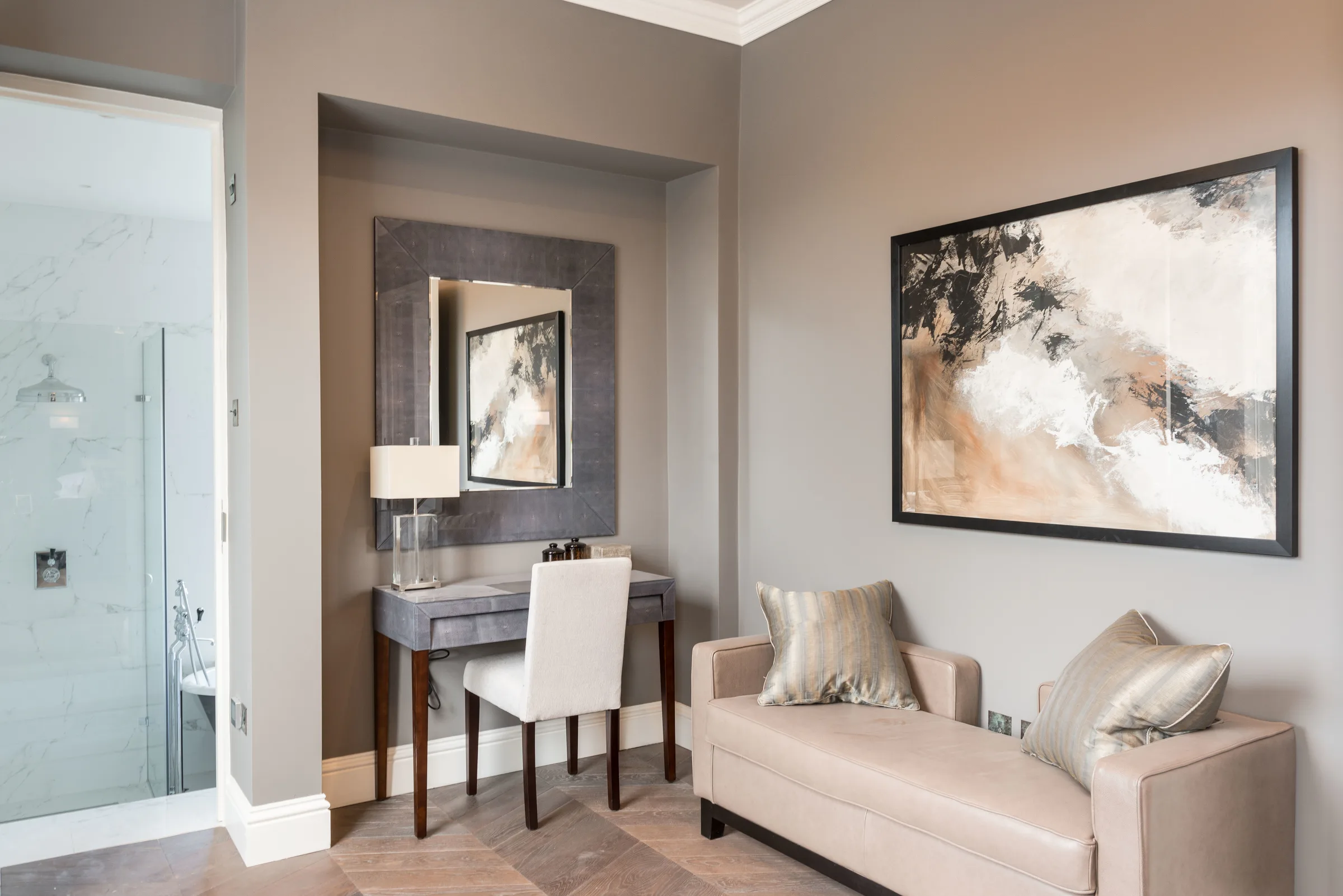
Hamilton Terrace · NW8
32Memphis / Post-Modern
References the Memphis Group design movement (1981–88) — geometric background shapes, primary colour palette with bold sans-serif. Deliberately playful and anti-serious. The large headline uses three colours across three lines as a typographic device. Works as an unusual luxury positioning if Volck wants to attract clients who are into design history and the post-modern revival currently happening in contemporary interiors (Dopamine Decorating, Neo-Memphis).
FontOutfit 700 — bold geometric. The Memphis movement used similar geometric display faces.
Layout50/50 split. Left: geometric shape background + type. Right: full-bleed image. Shapes add energy.
Palette#ff6b6b coral, #4ecdc4 teal, #f0c040 yellow on #fff — Memphis primary palette
TonePlayful and self-aware. "Spaces. Worth. Living." Three words, three colours — typographic wit.
TacticDesign history signal — for clients who recognise the reference and appreciate the wit.
UXGeometric shapes create visual layering without breaking the layout. Nav as bordered button cluster.
Volck
Spaces.Worth.Living.
Bespoke residential interiors. Designed to be used, loved and kept.
WorkStudioContact
33Outline / Wireframe
Typography rendered as outlines only — -webkit-text-stroke, no fill. The headline exists purely as line, not mass. The right panel image is reduced to 15% opacity with a wireframe rectangle overlay. References the architectural drawing tradition — spaces described in line before they are built. Conceptually strong for a studio that wants to foreground the design process. Visually unique in the interiors market.
FontSpace Grotesk 700 with text-stroke only — headline as pure outline/vector form. Conceptual.
Layout50/50 hard split. Left: outline type + bordered nav. Right: ghosted image + wireframe rect overlay.
Palette#fff background, #1a1a1a outlines only — achromatic reduction to pure line
ToneCerebral and process-oriented. "The room begins as a line." Design-intelligence signalling.
TacticForeground the design process — positions Volck as thinkers first, decorators second.
UXHigh intellectual intrigue — the outline type demands a second look. Unusual and memorable.
Volck
SPACE
BEGINS
HERE.
The room begins as a line. Then a conversation. Then a place worth living in.
ProjectsStudioContact
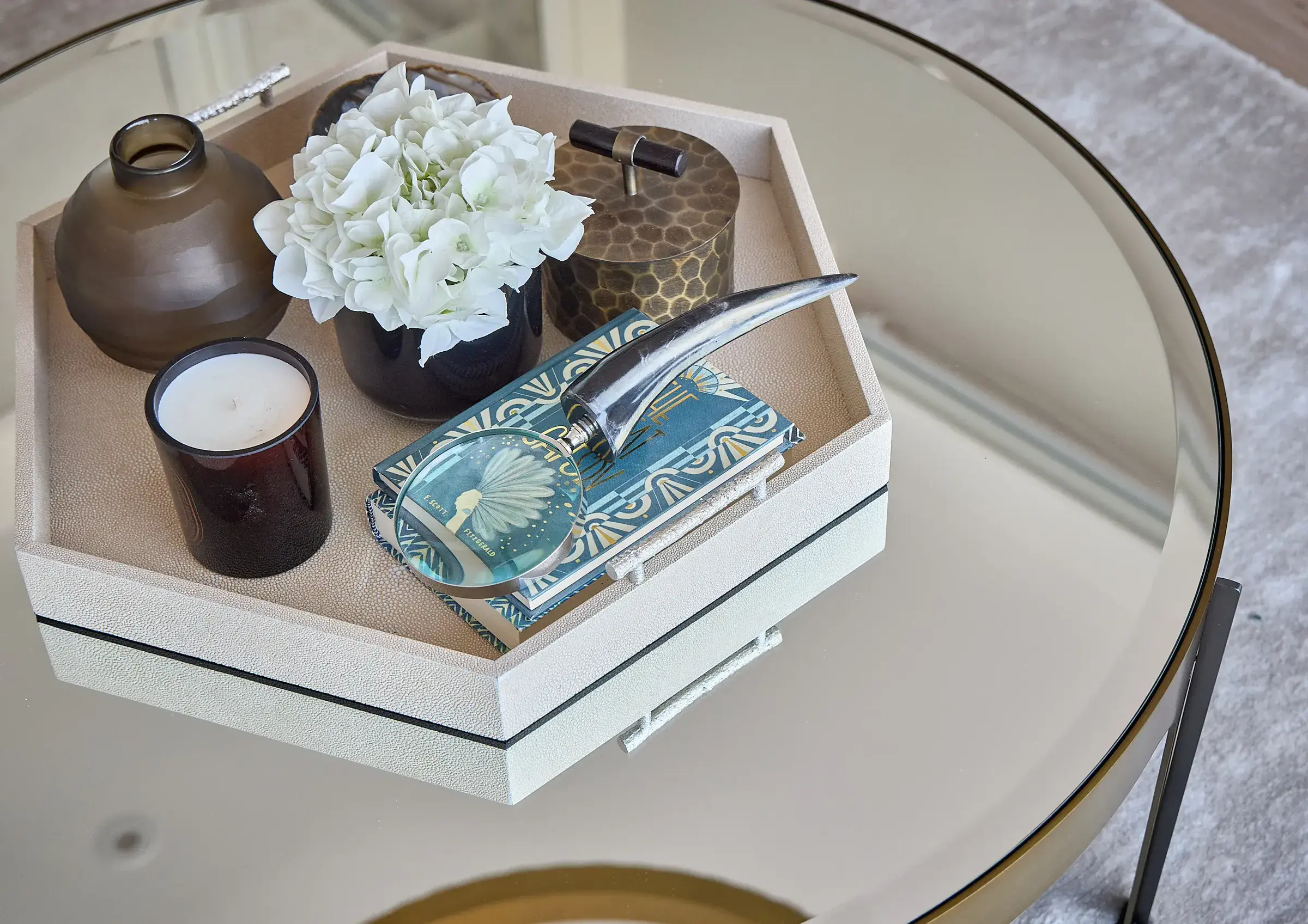
Westminster Apartment — SW1
34Gradient Noir
Rich indigo-to-black gradient with a centred purple glow orb. DM Serif Display for the headline — a contemporary slab-serif with strong character. The headline italic uses a CSS gradient fill (purple to violet) creating a luxury glow effect. Photography rendered in luminosity blend at 40% — present but dreamlike. References the visual language of luxury fragrance brands (Byredo, Le Labo) and high-end hospitality. Dark, sophisticated, memorable.
FontDM Serif Display — contemporary slab-serif with modern personality. Inter 300 for supporting copy.
Layout50/50 split. Left: gradient + glow + type. Right: luminosity-blended photography.
Palette#0d0d1a near-black, #1a0d2e deep purple, #c832ff violet, #7b2ff7 purple — noir gradient
ToneMysterious and elevated. "Where design becomes atmosphere." Photography is a mood, not a record.
TacticLuxury fragrance / beauty brand positioning. For clients drawn to sensory and atmospheric design.
UXThe glow orb creates a visual focal point before the type. Eye → glow → headline → CTA. Clear path.
Volck
ProjectsStudioContact
Where design
becomes
atmosphere.
Bespoke residential interiors in London. Nine projects. Every space considered from first principles.
View the work →
35Retail / Showroom
References luxury retail brands — Dover Street Market, COS, Maison Margiela. Tenor Sans in the header (a fashion-house workhorse typeface), horizontal category navigation, three-column product grid with image and caption below. Treats each project like a collection piece available to experience. The hover zoom effect is familiar from e-commerce — subverts expectations in the interiors context. Works particularly well if Volck has a physical showroom or product line.
FontTenor Sans — the typeface of luxury fashion e-commerce. Inter 300 for utility nav and captions.
LayoutStandard retail: fixed header + category nav + 3-column product grid with text below each image.
Palette#fff background, #1a1a1a text, #e5e5e5 grid lines — pure retail neutrality
TonePrecise and curatorial. Project names as product names. Location as variant. No persuasion needed.
TacticRetail pattern recognition — the most familiar luxury UX in the world applied to an unusual product.
UXFamiliar browse behaviour from luxury e-commerce. Hover zoom on image. Instant visual literacy.
Chelsea Penthouse
42 Savoy House · SW3
Westminster Apartment
Parliament View · SW1
Harrods Court
Knightsbridge · SW1
36Stacked / Accordion
Each project occupies a full-width horizontal row — project name left, image right, with a Roman numeral counter in the black left gutter. References the award show and agency case study format. On scroll, rows could expand to full-height (accordion behaviour). The black header with reversed-out type gives a strong frame. Four projects are scannable at a glance with clear location subtitles. Very strong for a portfolio-first studio.
FontCormorant Garamond 300 for project names and numerals, Inter 300 for location labels.
LayoutFull-width rows with 80px black numeral gutter. Each row: text left + image right. Header above.
Palette#f5f3ef warm off-white, #1a1a1a black gutter + header, #ddd9d0 row dividers
ToneCatalogue-precise. Project name, location. Nothing more. The image does the rest.
TacticPortfolio-first — puts the work front and centre from the very first screen. No preamble.
UXAccordion interaction affordance — each row invites expansion. High information density without clutter.
I
Chelsea Penthouse
42 Savoy House · SW3
II
Westminster Apartment
Parliament View · SW1
III
Hamilton Terrace
Flat E · NW8
IV
Harrods Court
Knightsbridge · SW1
37Monogram / Crest
The "V" monogram in a double-ring crest device — references heraldry, signet rings, and estate branding. Cinzel at large scale. The left panel is entirely identity-driven: the crest IS the homepage. Photography occupies the right in a split stack. Works as the strongest brand identity statement of all 40 directions — if Volck wants to build a truly distinctive visual mark that works across business cards, press materials and signage, this is the foundation.
FontCinzel 600 at 48px for monogram — Roman inscription weight. Cinzel 400 for all supporting text.
Layout50/50 split. Left: centred identity panel — crest + wordmark + tagline + nav. Right: stacked images.
Palette#f8f5ef warm parchment, #2a2010 umber, #c8b878 antique gold — heraldic triad
ToneCeremonial and established. The crest implies lineage — "Volck" as a name worth engraving.
TacticBrand identity first — builds a mark strong enough to exist on physical objects, not just screens.
UXLeft panel is static identity; right panel is the portfolio. Clean separation of brand vs work.
Volck
Bespoke Interiors · London
✦
PortfolioThe StudioCommissionsContact
38Paper / Analog
Warm aged-paper background with subtle grain texture (SVG noise filter). EB Garamond italic throughout — feels handwritten in comparison to the surrounding digital world. The photography sits in a slightly raised box with a generous margin and a soft shadow — like a mounted photograph on a studio wall. Caption positioned like a handwritten note. The most tactile and personal direction of the second set. Strong for a studio with a craft-led narrative.
FontEB Garamond italic 400 throughout — warm, humanist, feels written rather than set.
Layout50/50 split. Left: type with generous leading. Right: mounted photo with shadow + caption.
Palette#f0e8da aged paper, #3a2c1e dark umber, SVG grain texture overlay — tactile warmth
TonePersonal and intimate. "Beautiful rooms, carefully made." The italic feels like a handwritten letter.
TacticAnalog positioning in a digital world — the rarest signal of all. Craft as brand.
UXSlow and considered. The grain texture and warm tones reduce screen-glare anxiety. Calming browse.
Volck
Beautiful
rooms,
carefully
made.
Bespoke residential interiors for people who understand that how a room feels matters as much as how it looks.
ProjectsAboutContact
Kingston — 3 Manners House
39Split Identity — Dark / Light
A single viewport split exactly 50/50 into dark and light — the same brand expressed in both modes simultaneously. The headline continues across both panels. Left panel is dark with cream type; right panel is cream with dark type. The photography sits differently in each half. Conceptually expressive — it says the brand works in both worlds. Strong for a studio that genuinely has both moody-dark and light-bright projects in the portfolio.
FontCormorant Garamond italic 300 — same typeface in both modes, reversed. Visual continuity.
LayoutExactly 50/50 vertical split. Same layout mirrored — each panel is an inverse of the other.
Palette#1a1a1a left / #f5f1eb right — pure tonal inversion. No other colour.
ToneConceptual and considered. "Every interior / has two sides." The copy splits across the divide.
TacticBrand expression through contrast — shows range and confidence in the visual identity.
UXThe split creates instant intrigue — the eye tries to unify what is deliberately divided.
Volck
Every
interior
Bespoke residential design for those who understand that a great room takes time to make.
ProjectsAboutContact
Volck
has two
sides.
Nine projects. Each one a complete world, built around the people who will live in it.
ProjectsAboutContact
40Studio / Process
The only direction of the 40 that foregrounds process over portfolio. Numbered step list — Discover, Design, Develop, Deliver — makes the methodology visible. Albert Sans ultra-light at 200 weight. This is a strong direction if Volck's differentiator is their design process, not just their aesthetic output. Referenced by consultancy and architecture practices more than interiors studios — positions Volck as a studio that thinks before it specifies.
FontAlbert Sans 200–400 — ultra-light Scandinavian grotesque. Process steps at 400, headlines at 200.
Layout50/50 split. Left: full-bleed photo bleeding right. Right: logo + headline + numbered process steps + nav.
Palette#fafaf8 warm white, #1a1a1a, #e5e5e5 step dividers — clean, consultancy-neutral
ToneMethodical and transparent. "Here is how we work." Confidence through process visibility.
TacticProcess as USP — for clients who have been burned by unclear scope and want to understand the journey.
UXStep list is the most scannable structure on the page. Clients read it before the headline.
Volck Interiors
How a great
room gets made.
01
Discover
We begin with how you live — not how you want the room to look.
02
Design
Spatial planning, material selection, and every detail resolved before a single thing moves.
03
Deliver
We manage the process entirely. You come back to a finished room.
ProjectsAboutProcessContact