Volck — 20 Design Directions
Each concept below represents a distinct visual and brand language that could be built for Volck Interiors. From the expected "trophy minimalism" of the peer group, to editorial, brutalist, Japanese, dark luxury, and beyond. Scroll to compare.
01
Trophy Minimalism
The dominant genre across the peer set. Restrained, image-led, credible — but completely invisible in a competitive context. If you want to signal belonging to the tier, this is the safe bet. If you want to be remembered, it isn't.
FontCormorant Garamond — old-style serif, extreme contrast, luxury signal
Layout50/50 split — text left, hero image right. Static, vertical scroll.
PaletteCream #faf9f7 background, near-black type — zero colour distraction
ToneUnderstated authority. Copy is sparse, confident, assumes the work speaks.
TacticBlend in — signal category membership. Trust through familiarity.
UXMinimal nav, no CTAs, passive browsing — visitor self-qualifies
Volck
Projects
About
Contact
Interiors
defined by
intention.
Bespoke residential design.
London & beyond.
02
Dark Luxury
Cinematic, moody, private. Feels like stepping into a members club rather than a website. The dark palette makes the photography glow, and the amber accent reads as gold without being kitsch. Unusual in the interiors space — most go cream and white.
FontCormorant Garamond italic + Montserrat 200 caps — serif drama, sans precision
LayoutFull-bleed image behind content. Logo top-left, nav top-right. Copy anchored bottom-left.
Palette#0d0d0d near-black, #c9b99a warm amber, #e8e0d0 warm white text
ToneAtmospheric, seductive. Copy is poetic — "the art of the interior" — not functional.
TacticDifferentiate by feel — evoke exclusivity before the client reads a word.
UXImmersive first impression. Single scroll layer — no grid or index in sight.
Volck Interiors
Projects
About
Contact
The art
of the
interior.
Bespoke Residential Design · London
03
Swiss / International Grid
Borrowed from the modernist Swiss design tradition — think Müller-Brockmann. Every column, gutter and proportion is intentional. Positions Volck as a design practice with genuine spatial intelligence, not just a decorator. Signals rigour and intellectual confidence.
FontSpace Grotesk — geometric, rational, slightly warm. No serifs anywhere.
Layout4-column modular grid. Vertical sidebar nav. Strict cell boundaries with 1px rules.
Palette#f5f5f5 background, #1a1a1a black, #ddd rule lines — purely functional
TonePrecise, resolved, professional. Copy is factual and direct — no poetry.
TacticPosition as a design practice, not a lifestyle brand. Attract architecture-adjacent clients.
UXNavigation is structural — part of the grid itself. Disciplined visual hierarchy.
Bespoke
Residential
Design
Considered interiors shaped around the way you live. Every detail resolved.
Projects
About
Process
Contact
04
Editorial / Magazine
Architectural Digest as a website — bold 2px masthead rule, sidebar project snippets, thumbnail index. Positions Volck as press-worthy from the outset. The framing says: this studio's work belongs in print. Strong for clients who care about recognition and prestige.
FontBodoni Moda — high-contrast didone serif. Maximum editorial authority.
LayoutMagazine format: thick top rule, 2-column body split, sidebar thumbnails with captions.
PalettePure #fff, #1a1a1a black, no other colour — ink on paper aesthetic
ToneAuthoritative and editorial. Copy is feature-article quality, not sales copy.
TacticBorrow credibility from the editorial world. Feel like you've already been featured.
UXScanning behaviour — headlines, images and captions. Like flicking through a magazine.
Volck
Projects
About
Press
Contact
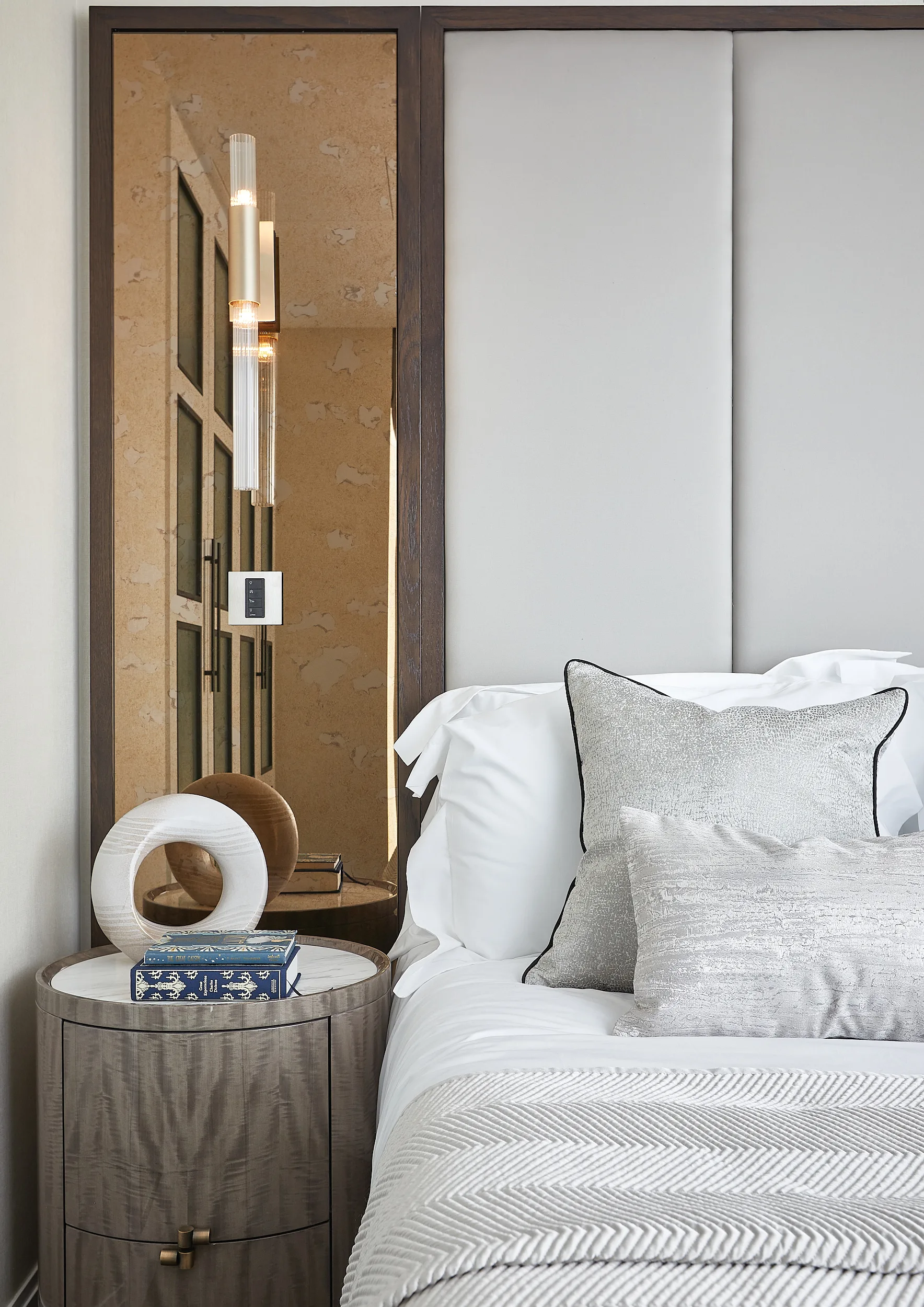
Chelsea
Penthouse
Studio — London — Est. 2018
Spaces that hold their own long after the work is done
Volck creates bespoke residential interiors where material quality and spatial intelligence converge. Each project begins with a conversation and ends with somewhere extraordinary to live.
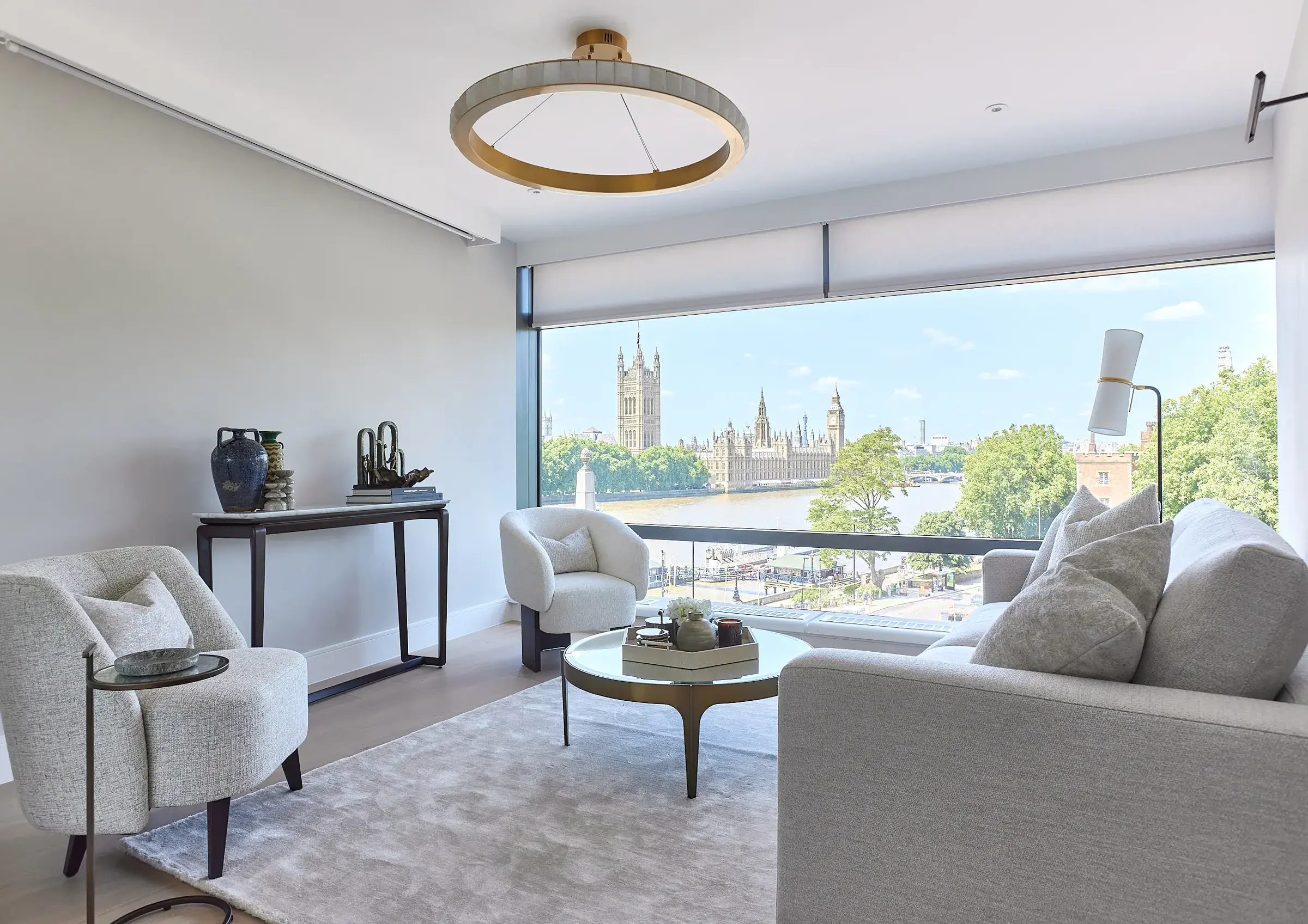
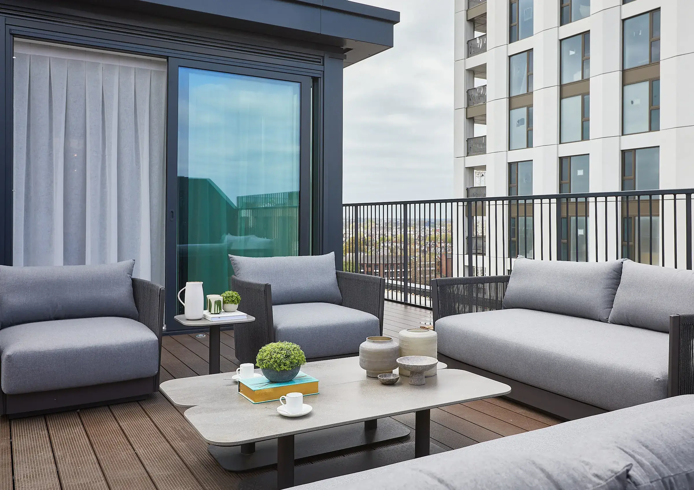
Westminster ApartmentParliament view. Restrained palette.
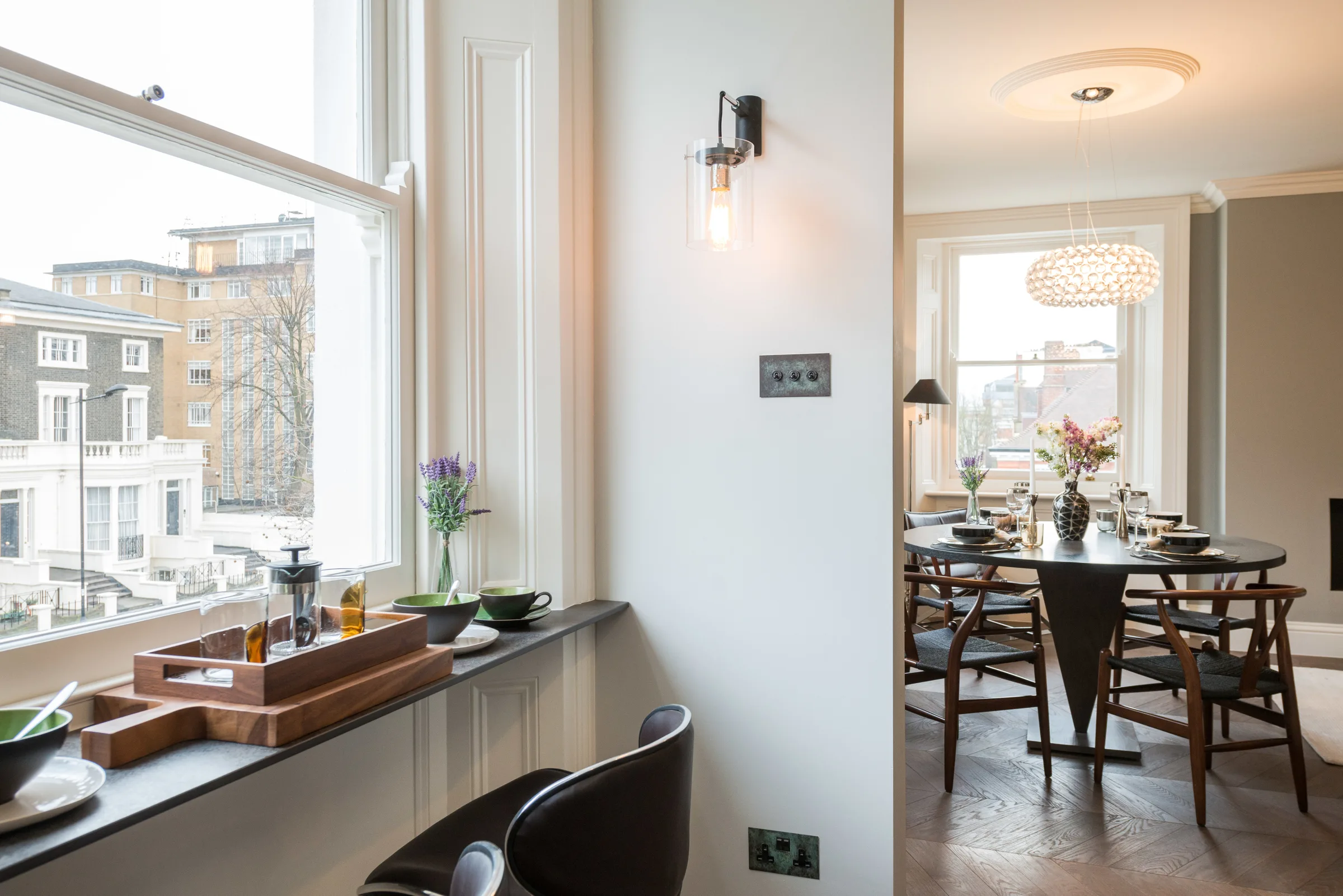
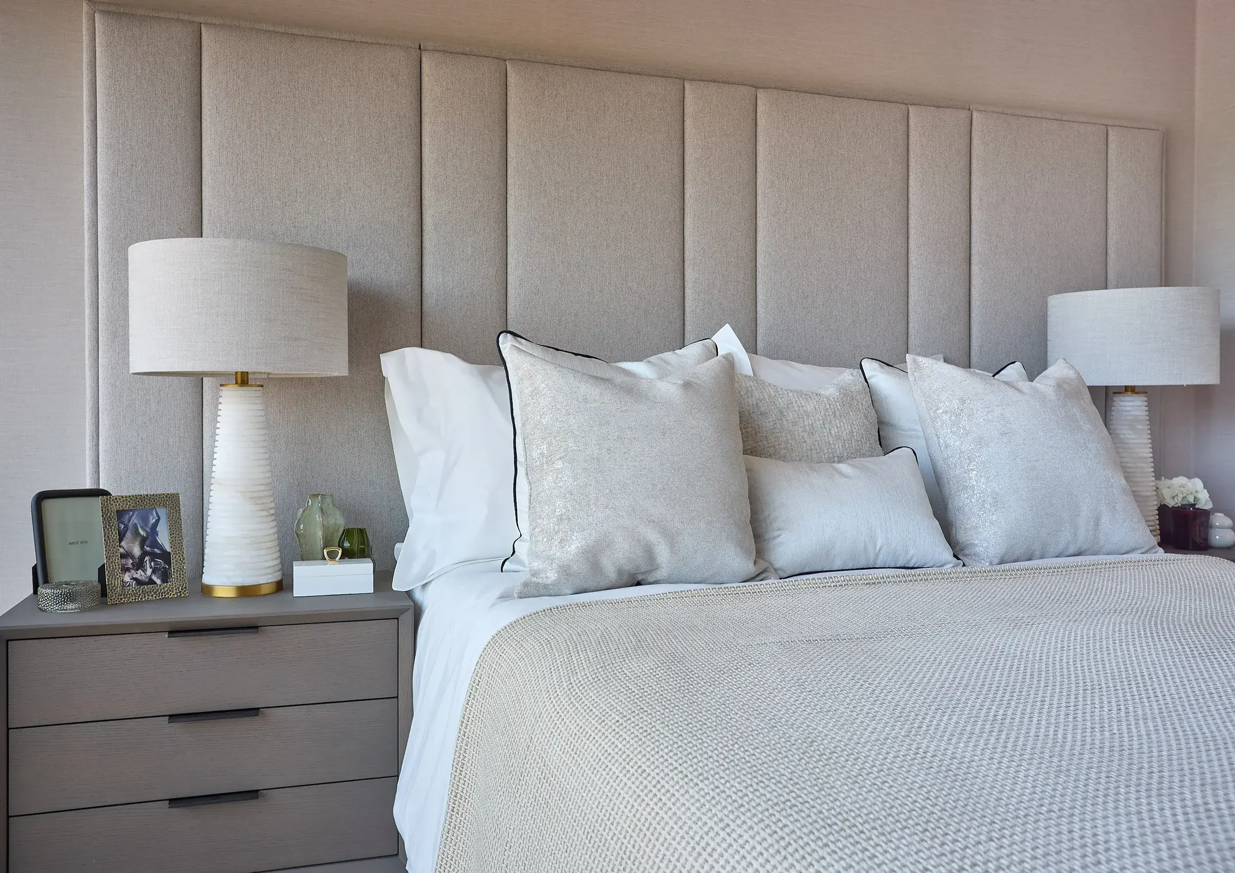
Hamilton TerraceNW8. Period conversion.
05
Brutalist / Bold Type
Deliberately breaks every rule in the luxury interiors playbook. Unbounded at 900 weight, 90px, all-caps. The word "INTERIORISM" owns the left half entirely. Polarising — some clients will hate it, the right ones will immediately get it. Supremely memorable.
FontUnbounded 900 — maximum weight geometric. Zero concession to elegance.
LayoutHard 50/50 vertical split with 3px border rule. Typography IS the left panel.
Palette#f0ede8 warm off-white, #1a1a1a black. No decoration — form only.
ToneConfrontational and direct. "No templates. No shortcuts." — no softening at all.
TacticRepel the wrong clients, attract strong-minded ones who want the real thing.
UXIntentionally jarring entry. Forces a reaction — you either stay or you leave.
Volck
INTE
RIOR
ISM.
We design the spaces London's most particular people choose to live in. No templates. No shortcuts.
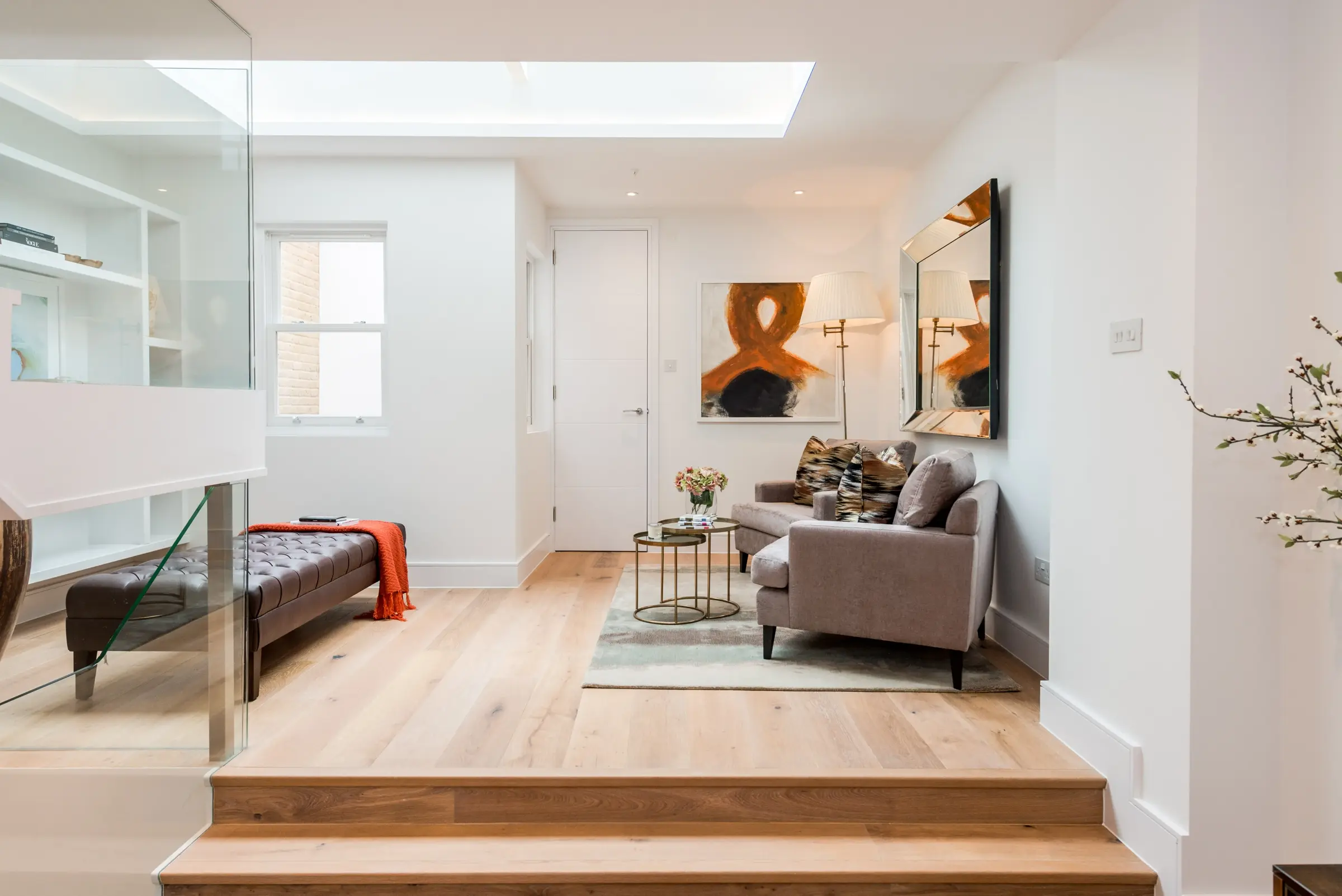
Featured project: Broadley Street
Work
Studio
Process
Talk
06
Japanese Minimalism
Rooted in the Japanese concept of ma — the meaningful use of negative space. The vertical logotype, asymmetric panel layout, and muted photography create a sense of deliberate stillness. Nothing like anything in the London interiors market. Exceptional for a boutique positioning.
FontBIZ UDMincho for logotype (Japanese-influenced), Inter 300 for UI — calm contrast
LayoutNarrow fixed left panel with vertical type. Full-bleed image right. Asymmetric composition.
Palette#f7f5f2 warm paper, #2a2520 deep brown, #e0dbd4 ruled lines — earthen, natural
ToneContemplative and philosophical. Quote-led copy — a statement of design intent, not a pitch.
TacticSignal craft and quiet confidence. For clients who value substance over show.
UXSlow, intentional. Forces the visitor to pause. No rush to click.
VOLCK
Projects
Studio
Contact
001 / 009
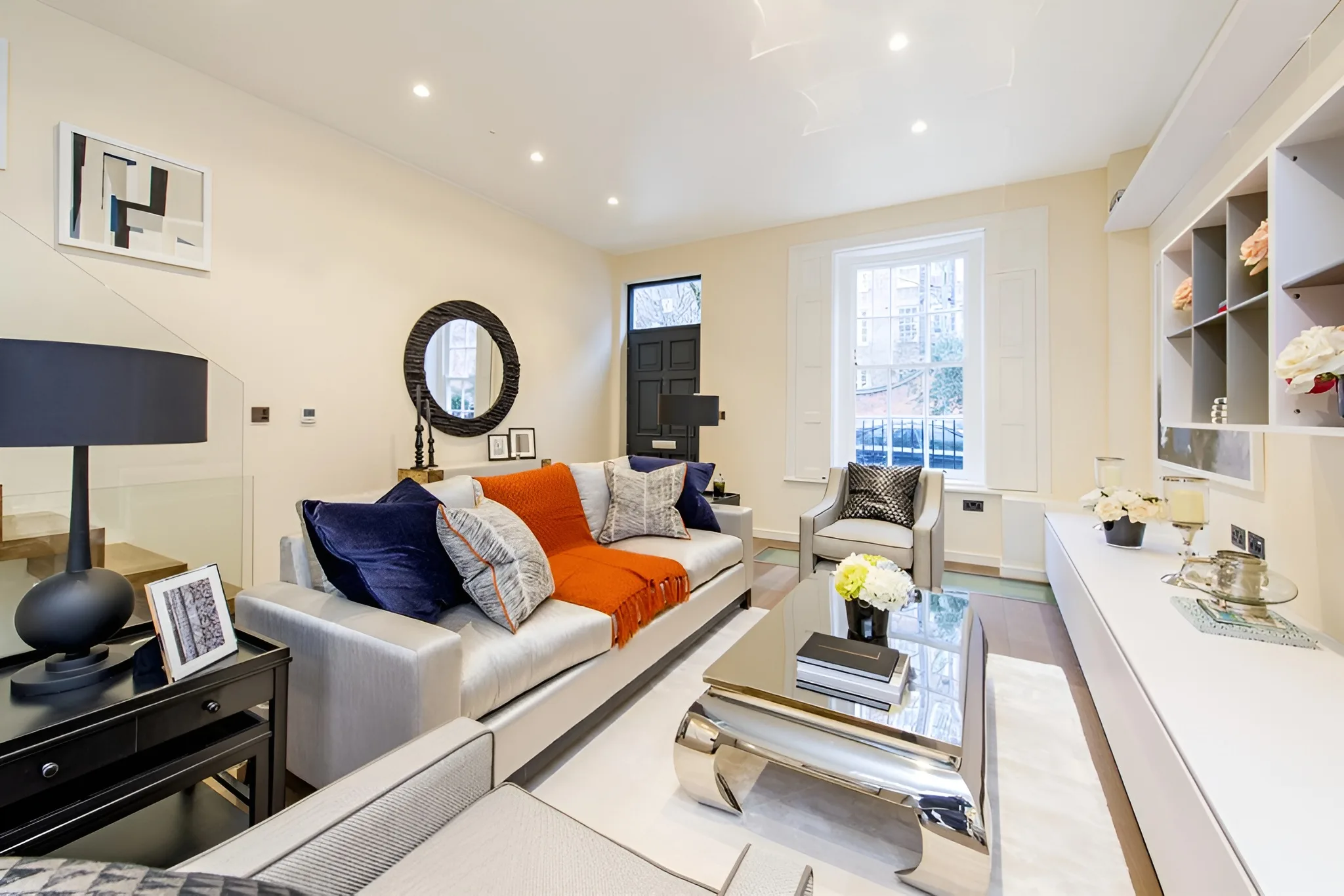
Every room contains a silence worth designing towards.
Coombe Hill Residence
07
Art Deco Revival
Theatrical and opulent — a deliberate nod to 1920s Deco geometry interpreted through a contemporary lens. Double border frames, gold gradient accents, and perfect bilateral symmetry. High identity value, strong on print collateral extension. Could feel dated if executed wrongly — here it reads as intentional.
FontCinzel — Roman-inspired all-caps serif with classical engraved quality. Maximum gravitas.
LayoutCentred symmetrical composition. Double border frame inset. Project thumbnails as a strip.
Palette#1a1610 near-black, #c9a84c antique gold, #e8d8a0 warm ivory text
ToneCeremonial, elevated. Ornamental section dividers. Language is formal and unhurried.
TacticStrong brand identity play — builds instant recognition. Risks feeling costume-y if not fully committed.
UXRitualistic entry — symmetry demands a pause before scrolling. Theatre is the experience.
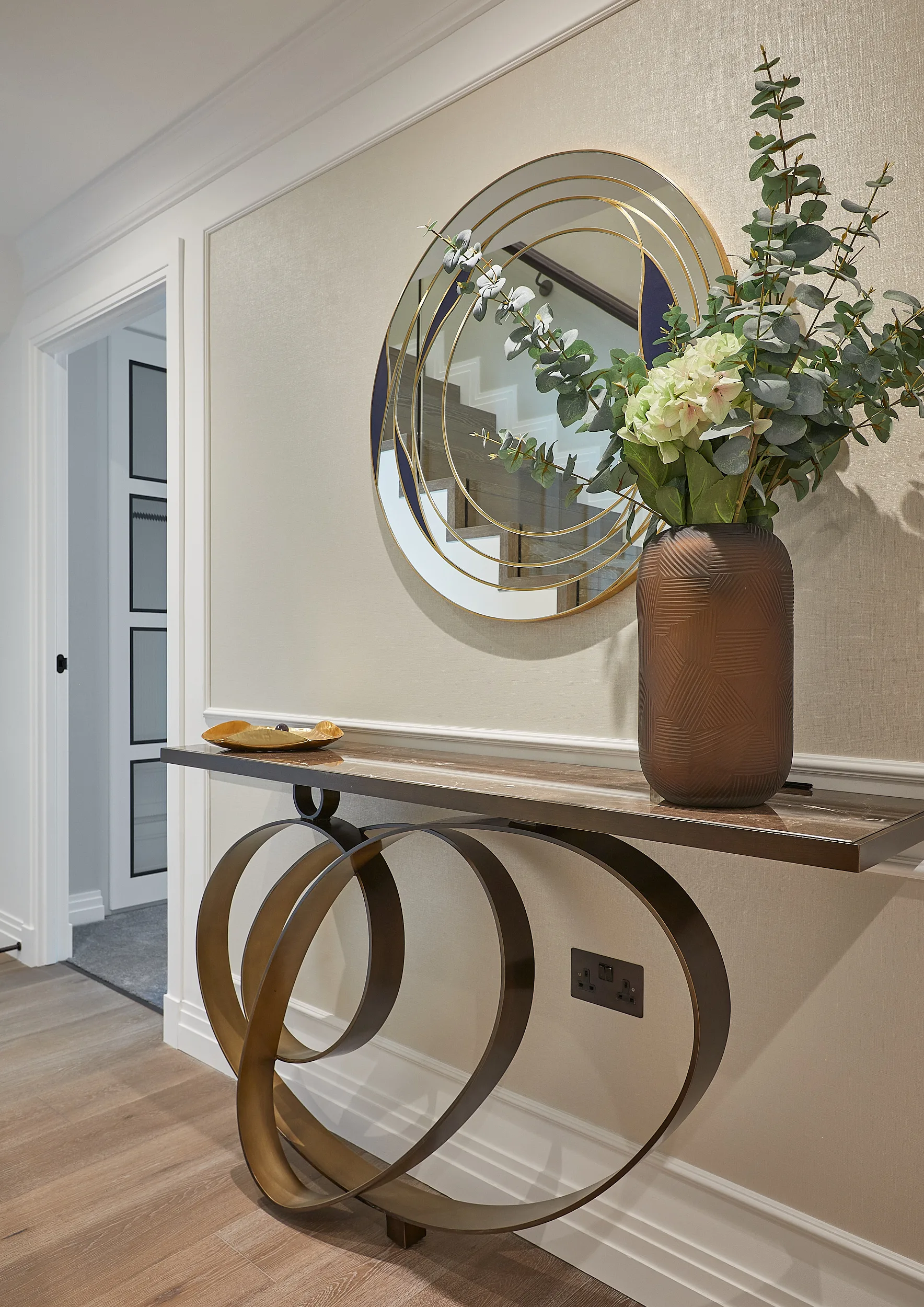
— ✦ —
Volck
Interiors · London
Portfolio
Atelier
Commissions
Contact
08
Full Bleed / Ghost UI
The most photography-confident approach of all 20. The entire viewport is the image — the UI exists only as hairline text at the extreme edges. Used by luxury fashion and travel brands. The unspoken message: the work is so strong it needs no frame. Only works when the photography is excellent. It is.
FontRaleway 100–300 for all UI, Cormorant Garamond italic for project title — ghost-light
Layout100vw × 100vh image. Nav floats top, project name anchored bottom-left. Counter top-right.
PalettePhotography-defined. UI text is rgba white at 50–90% opacity only.
ToneSilent confidence. UI text is functional only — labels, not language. Zero decoration.
TacticLet the photography do all the selling. Trust that the image closes before the copy does.
UXSlideshow or scroll-through projects. Each image is a full viewport moment. Immersive.
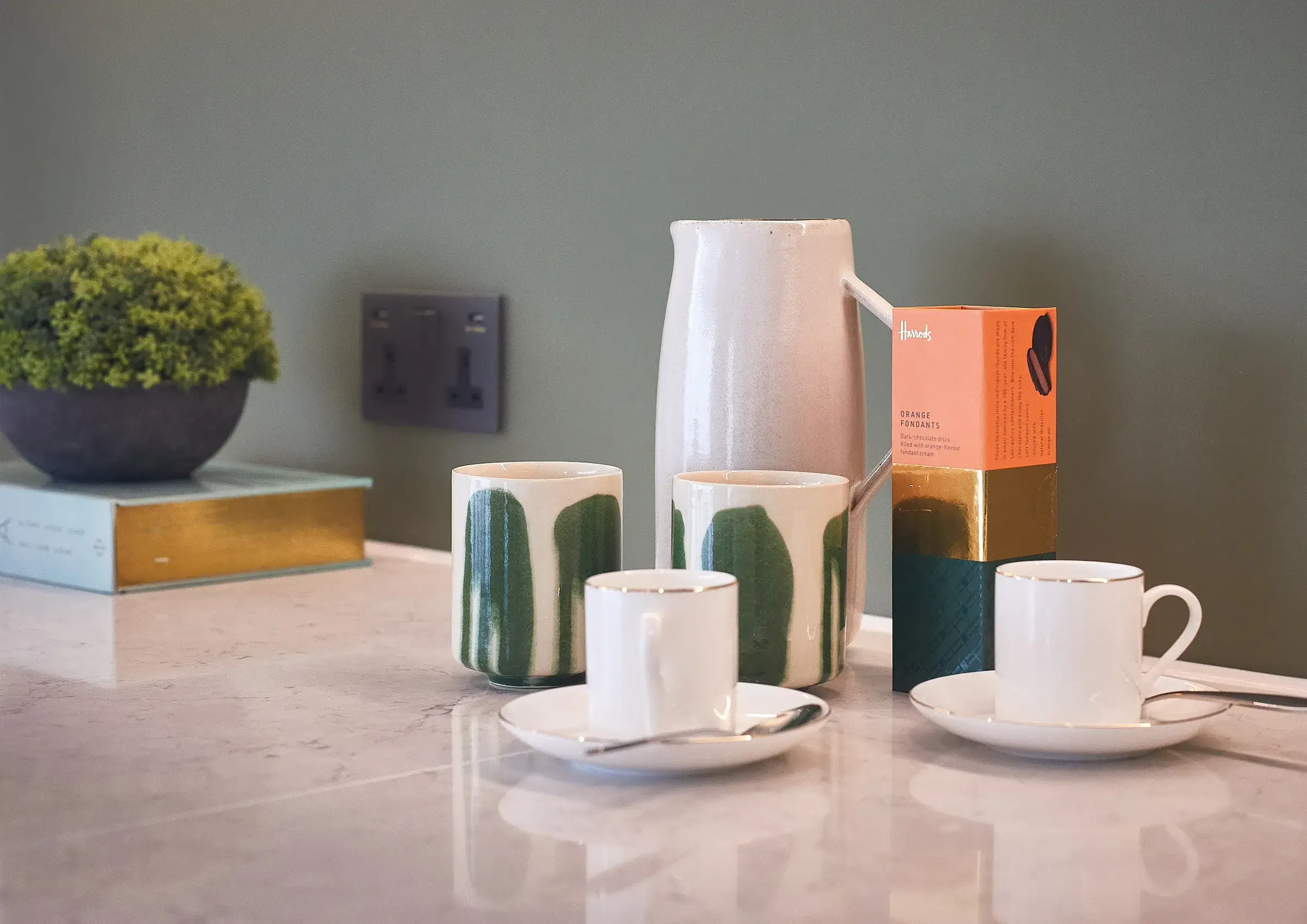
Currently viewing
Chelsea
Penthouse
View Project
09
Warm Earthy / Organic
Where the rest of the category goes cold and white, this goes warm and tactile. Sand, linen and terracotta tones reference the material palette of the interiors themselves. Fraunces is a variable "wonky" serif — designed to feel handmade. The most approachable and human of all 20 directions. Particularly strong for residential clients who want to feel comfortable, not intimidated.
FontFraunces italic 100 weight — variable "wonky" serif. DM Sans 300 body. Warm pairing.
Layout3-column project index below a full-width header bar. Each column is image + caption card.
Palette#e8e0d5 sand background, #2d2318 dark brown, #c8bfb3 warm ruled lines
TonePersonal and collaborative. Copy is warm and direct — not corporate, not poetic.
TacticStand out by being human. Most luxury sites feel cold — this one feels like a conversation.
UXApproachable grid. Clear project labelling with location. Easy to browse and understand.
Coombe Hill
Private Residence · Kingston
Westminster
Parliament View Apartment · SW1
Hamilton Terrace
Period Apartment · NW8
10
White Cube Gallery
Frames the work as art objects in a gallery rather than rooms in a house. The dense 5-column masonry grid references Gagosian or White Cube — spaces where work is shown without commentary, trusting the viewer to engage. Positions Volck in the art world orbit, which adds cultural cachet beyond the interiors category.
FontInter 300–400 only. No display typeface. Typography is entirely structural, never decorative.
Layout5-column masonry grid with 1px gaps on #e5e5e5 background. Two cells span 2×2 for hierarchy.
PalettePure #ffffff cells on #e5e5e5 grid lines. Photography provides all colour.
ToneNeutral and institutional. Labels only — no persuasion. The work argues for itself.
TacticArt world positioning. Borrow cultural authority from gallery culture, not lifestyle media.
UXDense visual scanning — high information density. Hover reveals captions. Clean, fast.
Chelsea Penthouse — 42 Savoy House
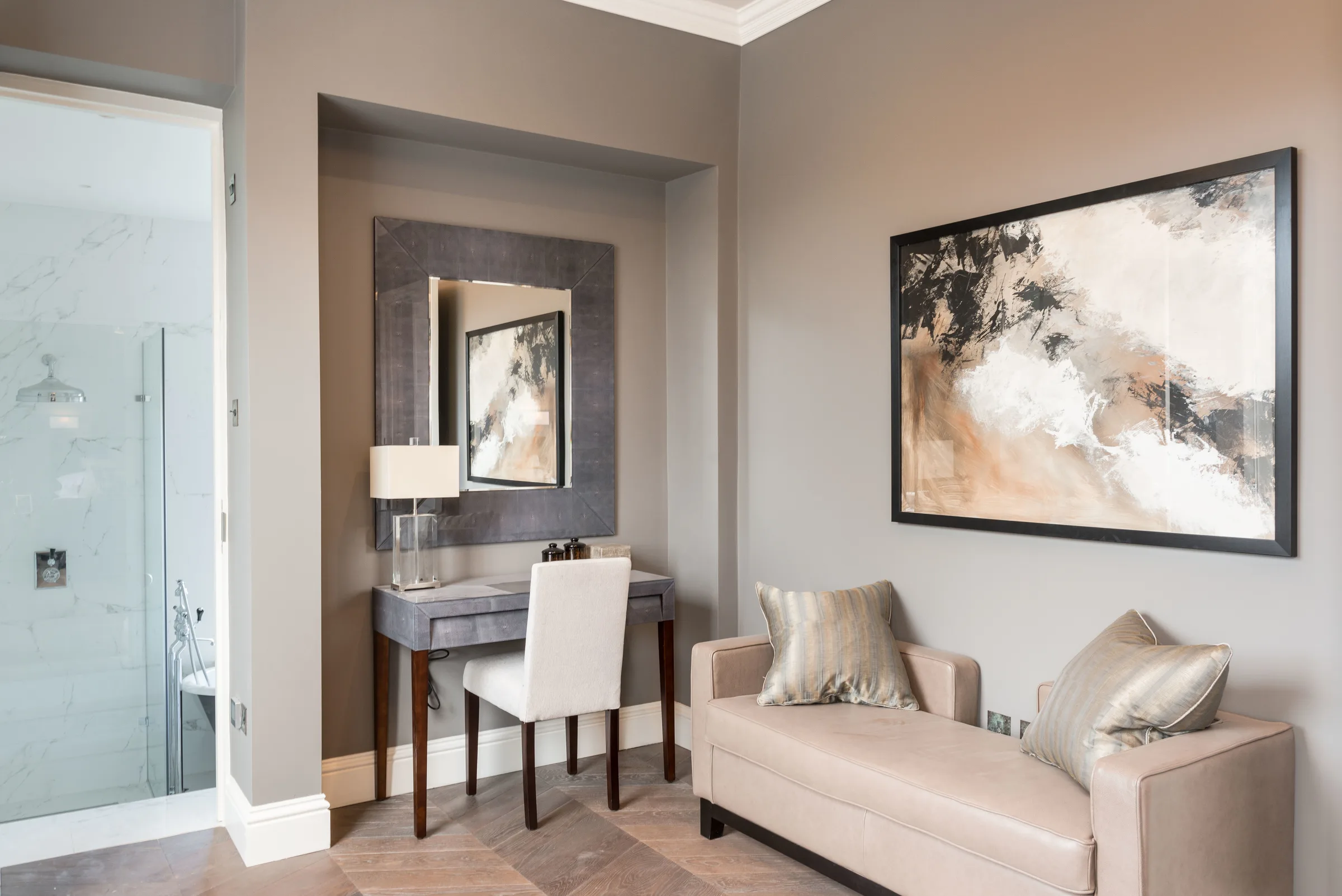
Westminster Apartment
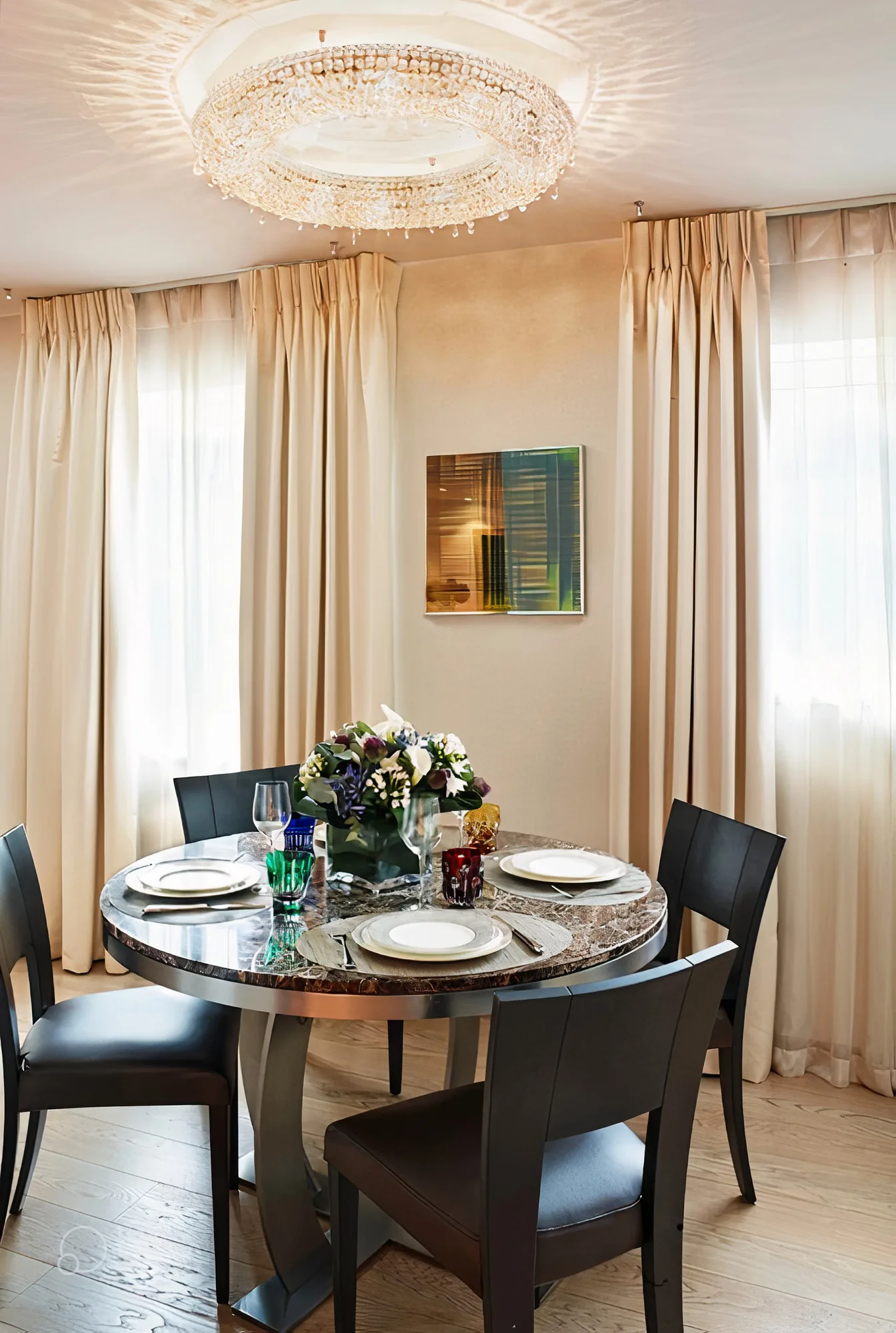
Hamilton Terrace
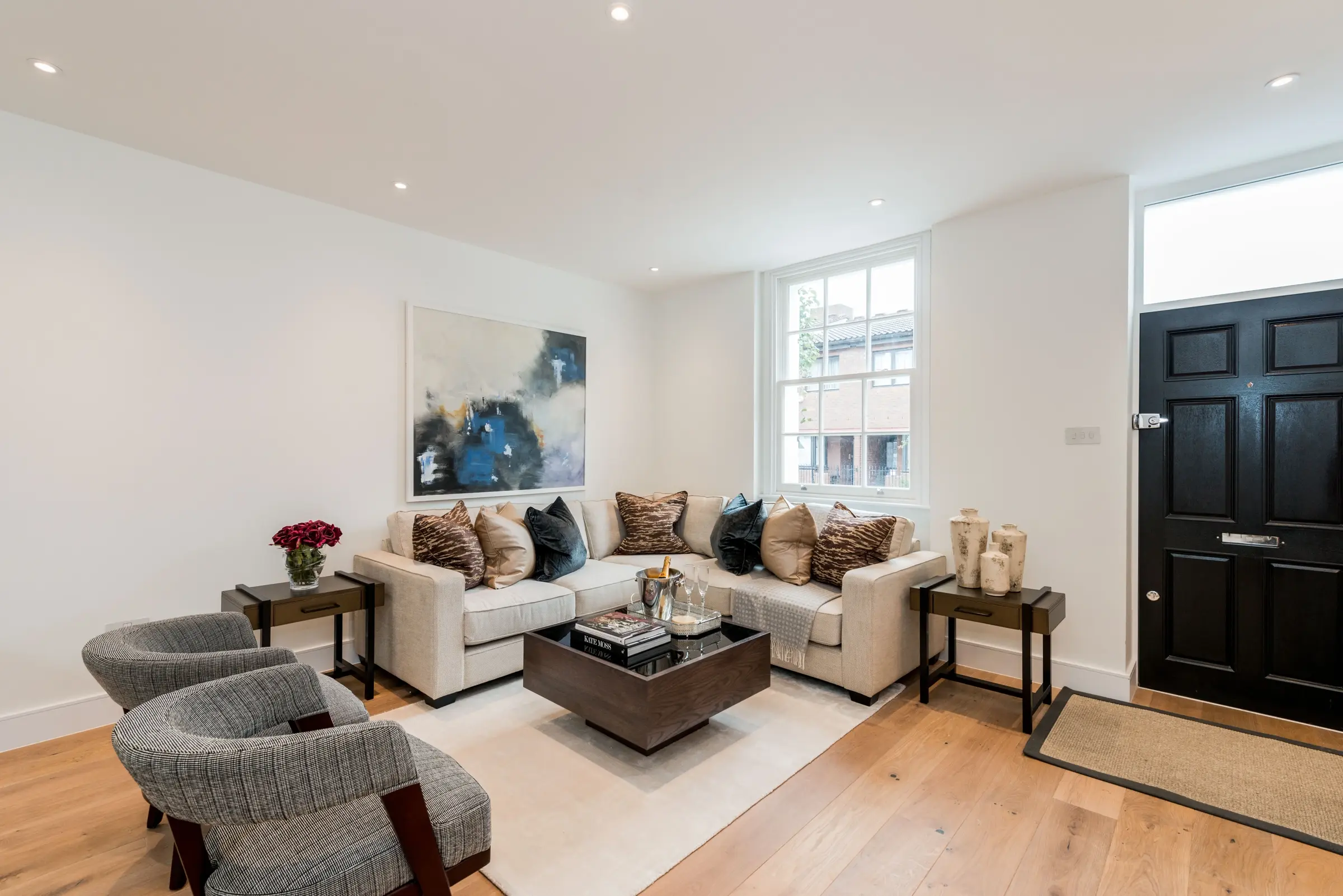
Harrods Court
Broadley Street
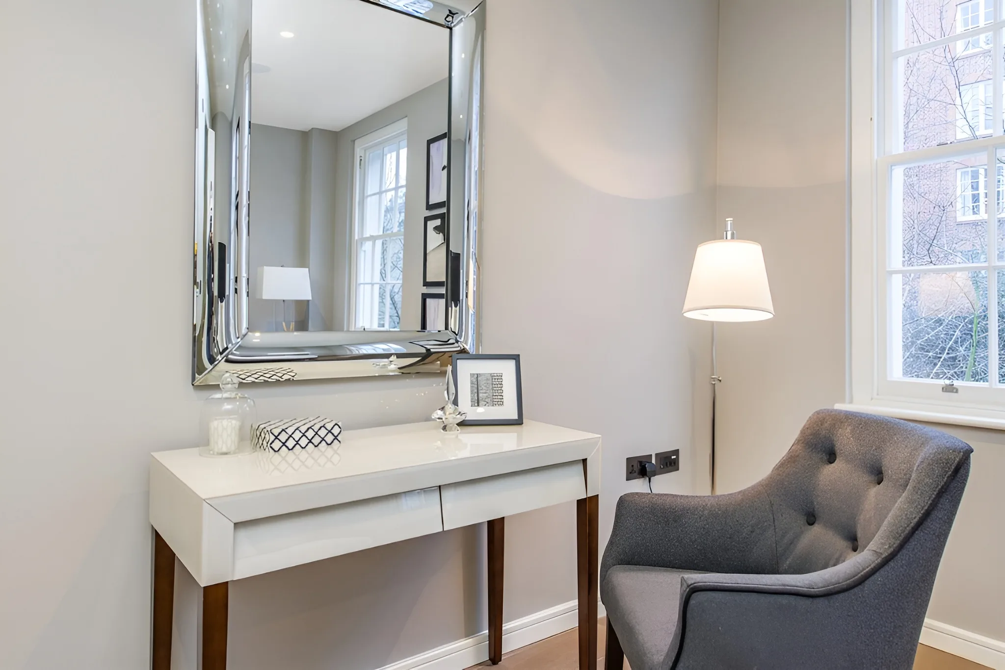
Coombe Hill
11
French Fashion House
Direct reference to the visual language of Parisian fashion houses — Celine, The Row, Loro Piana. Centred masthead with flanking navigation, a three-column image triptych, all in EB Garamond. The copy is sparse and lapidary. Clients in the fashion or luxury goods world will feel immediately at home here.
FontEB Garamond 400 + italic — classical, unhurried. Inter 300 for nav at near-invisible scale.
LayoutCentred symmetric header, thin rule separator, 3-column full-height triptych below.
Palette#fdfcfa warm white, #1a1a1a black, #e8e4de warm ruled lines — no accent colour
ToneLapidary and quiet. "Where restraint becomes the loudest thing in the room." Copy is epigram-quality.
TacticFashion house positioning. Borrow cultural capital from luxury fashion, not interiors sector.
UXRitualistic. The centred header slows entry deliberately. Lateral nav flanks are unusual and refined.
Where restraint becomes the loudest thing in the room
Nine completed projects. Each one a collaboration. None of them repeated.
12
Monochrome / B&W
All photography desaturated to greyscale. Removes colour entirely as a variable — forces the viewer to engage with form, light and spatial composition alone. The three-word copy structure ("Form. Light. Space.") operates as a brand manifesto. Looks like a gallery monograph or a Taschen publication. Highly distinctive — almost no interiors studios go full monochrome.
FontLibre Baskerville italic — heavy old-style serif with strong ink contrast. Josefin Sans 100 UI.
LayoutHard 50/50 split. Full greyscale image left. Dark right panel with floated type blocks.
Palette#000 and #0a0a0a background, #fff text, #333 rules — purely achromatic
ToneArchitectural, timeless. Three-word manifesto structure. Confident to the point of austerity.
TacticStrip away colour so the spatial quality of the work becomes undeniable.
UXStark and immediate. Minimal information — forces the visitor into a considered decision to engage.
Volck · London
Form.
Light.
Space.
13
Narrative / Scrollytelling
Breaks the portfolio-grid convention entirely — structured as a long-read rather than a gallery. The copy leads; the images support. This approach is common in journalism (NYT, The Atlantic) but almost completely absent from interiors. It builds trust through explanation and positions Volck as a studio with a considered philosophy, not just a catalogue of rooms.
FontSpectral — a screen-first serif designed for long reading. Generous x-height, open apertures.
LayoutWide left text column, narrow right image stack. Inspired by magazine feature layout.
Palette#f9f7f4 warm paper white, #1a1a1a text, #e5e0d8 rule lines — reading-optimised
ToneReflective and philosophical. "Every room deserves to know what it's for." Copy earns its space.
TacticBuild trust through ideas — attract clients who want a studio that thinks, not just executes.
UXScroll-paced narrative. "Scroll to explore" prompt. Sequential revelation of story + imagery.
Volck
Every room deserves to know what it's for.
We design interiors that have a clear point of view — where every decision connects back to the people who will live there. Not surfaces. Not trends. Spaces.
Scroll to explore
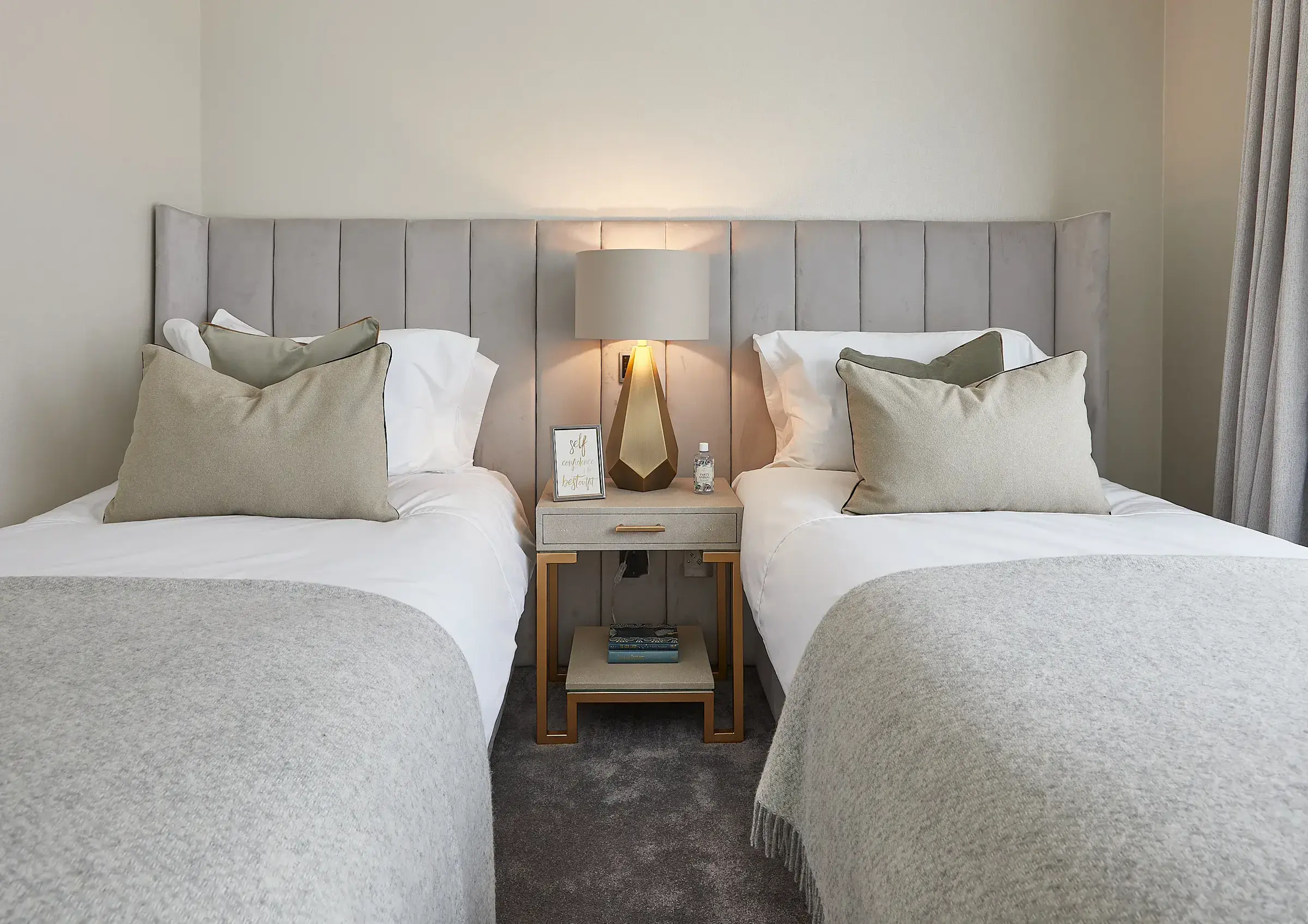
Chelsea Penthouse
14
Bauhaus / Geometric
References the Bauhaus principle that structure IS ornament. The heavy black bars are not UI — they are the visual language. Large Roman numerals as decorative elements (a Bauhaus device). Space Grotesk was designed with Bauhaus influence in mind. The result is rigorous and unexpected — positions Volck at the intersection of design history and contemporary practice.
FontSpace Grotesk — geometric grotesque. Bauhaus-influenced proportions. Consistent across all scales.
LayoutStructural grid defined by solid black bars (not lines). Cells of varying span ratios.
Palette#f2ede6 warm off-white, #1a1a1a black bars, #e8e1d5 secondary cells — no accent
ToneRational, declarative. "IX Projects Completed" — data as design. No softening.
TacticSignal design literacy — this studio understands design history. Attracts design-aware clients.
UXGrid is legible and navigable. The structure guides the eye without conventional navigation.
Volck
Work
Studio
Contact
Interior Design · London
Bespoke residential interiors for London's most considered clients.
→
15
Deconstructed / Overlapping
Breaks the grid completely. Photos overlap each other with drop shadows and slight rotations. Giant ghosted "Volck" sits behind everything at 200px as a watermark-logo. The visual language of fashion editorials and magazine covers — dynamic, layered, contemporary. Unusual in interiors because it requires confidence in the brand identity to pull off.
FontCormorant Garamond 300 for headlines, Inter 300 body — elegant contrast with chaotic layout
LayoutAbsolutely positioned overlapping images. Text block floated top-right. No grid constraints.
Palette#f5f3ef warm off-white, #1a1a1a, rgba ghosted background logo — layered depth
ToneEvocative and poetic. "Some spaces stay with you." Emotional register over rational.
TacticFashion editorial energy. For clients who respond to feeling over information.
UXNon-linear visual entry. Eye moves through overlapping images before finding the nav.
Volck
Volck Interiors
Some
spaces
stay
with you.
Bespoke residential design for people who know what they want — and need someone who can get them further than that.
Projects
Studio
Contact
16
Serif Heavy / Literary
Leans entirely into the written word as a positioning tool. Playfair Display at 68px leads with a manifesto statement. Long-form Spectral body text follows. The italicised word "never" inside the headline is a typographic argument in itself. Works for a studio that has a clear point of view about how spaces should be designed — and wants clients who value that intellectual rigour.
FontPlayfair Display 400 — high contrast transitional serif. Spectral 300 for long-read body copy.
LayoutWide text column left with 3-part vertical rhythm, tall portrait image locked right.
Palette#faf8f4 warm ivory, #8a7a6a muted amber accent, #1a1a1a text — warm and considered
TonePhilosophical and precise. Manifesto-quality copy. "The thoughtful interior is never an accident."
TacticIntellectual positioning. For clients who want a studio with a genuine point of view, not just taste.
UXCopy-first hierarchy. Read before you look. Unusual — demands more from the visitor.
Volck
The thoughtful
interior is
never an
accident.
It is the result of sustained attention — to how light falls, how rooms connect, how people actually move through their own homes. That is our work.
View our projects →
17
Blueprint / Technical
References the architectural drawing and technical specification language that sits behind every interior — the thing clients never see. Grid paper background, annotation-style callouts, photography rendered in blueprint duotone. Completely unique in the residential interiors space. Signals that Volck understands the technical as well as the aesthetic — strong for clients who've worked with architects and expect that level of precision.
FontSpace Grotesk 300 throughout — technical precision. Annotation-weight text at 9–11px.
LayoutBlueprint grid background, 50/50 split, left side technical spec panel, right image with annotations.
Palette#0a1628 navy, #087cfa blue, #4a8fc4 mid blue, #a8c4e0 text — monochromatic blueprint
TonePrecise and technical. Specification language — studio location, project count, specialisation.
TacticOwn the technical territory no other studio claims. Rigour as brand differentiator.
UXData-informed layout. Annotation callouts on images. Feels like a design document, not a brochure.
Project 001 of 009
Designed
with
precision.
Studio established: London
Projects completed: 9
Specialisation: Bespoke Residential
Approach: Spatial + Material
Projects
Studio
Contact
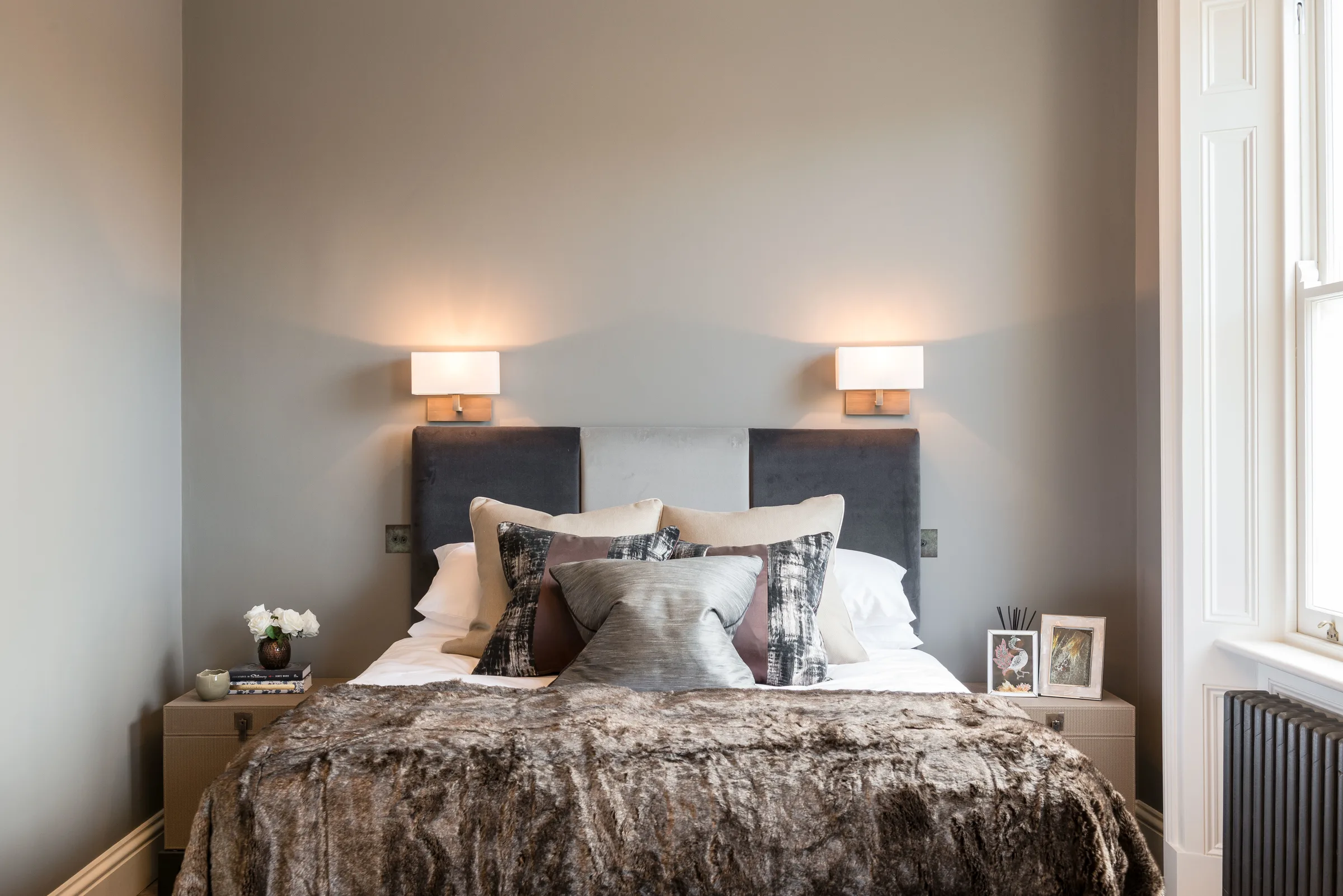
Hamilton Terrace — NW8
18
Warm Dark / Amber
Dark luxury with warmth — the difference between a private members club in Mayfair and a cold hotel bar. The deep warm brown (#2a1f1a) is far more intimate than the more common near-black. Photography is desaturated and overlaid — the rooms exist as impressions, not records. Roman numeral project indices (I, II, III) add ceremony without ostentation.
FontEB Garamond italic — classical and warm. Inter 300 nav. Old and new in deliberate tension.
LayoutFull-height 3-column triptych. Floating header. Content anchored to bottom of each column.
Palette#2a1f1a warm espresso, #e8ddd0 warm ivory, #8a7a6a amber-brown mid-tone
ToneIntimate, ceremonial. Project names in italic with address as subtitle. Quiet formality.
TacticWarm dark differentiates from cold white peers. Feels like hospitality rather than commerce.
UXThree projects visible simultaneously without scrolling. Comparison browse. Low friction.
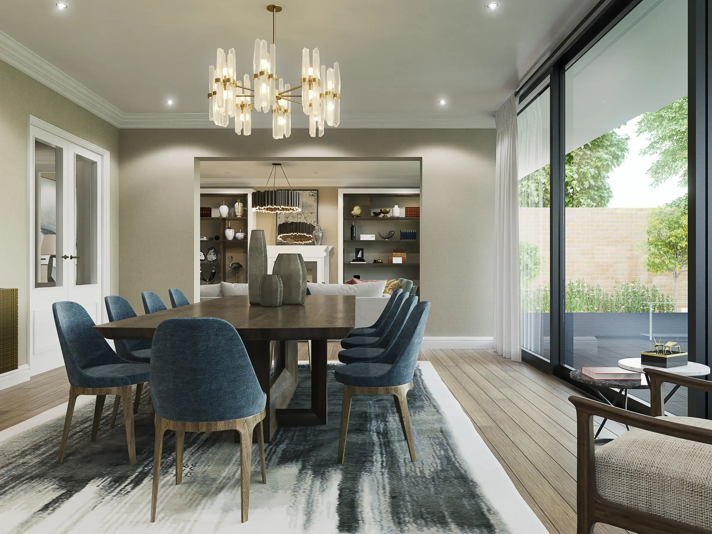
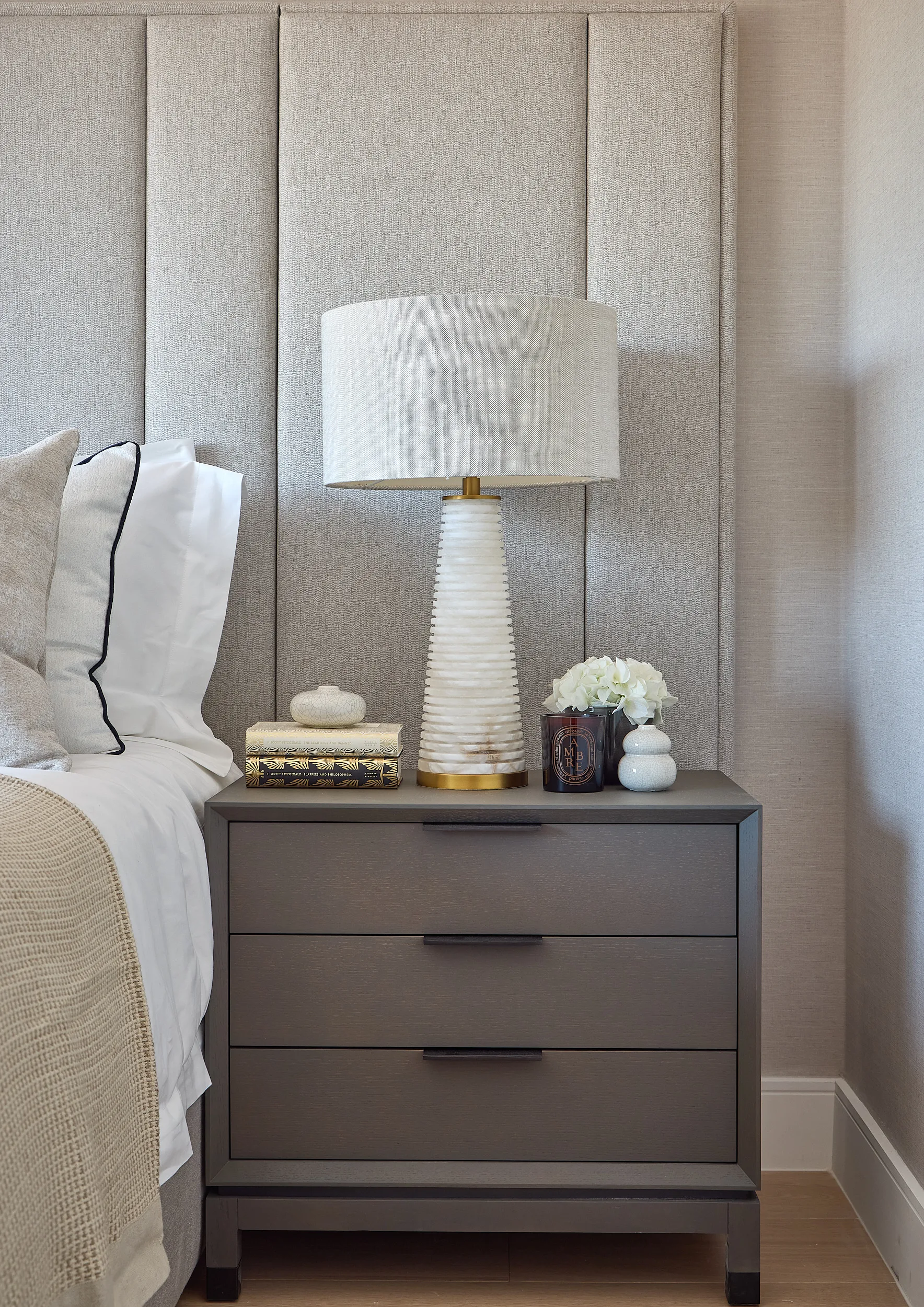
I
Chelsea Penthouse
42 Savoy House · SW3
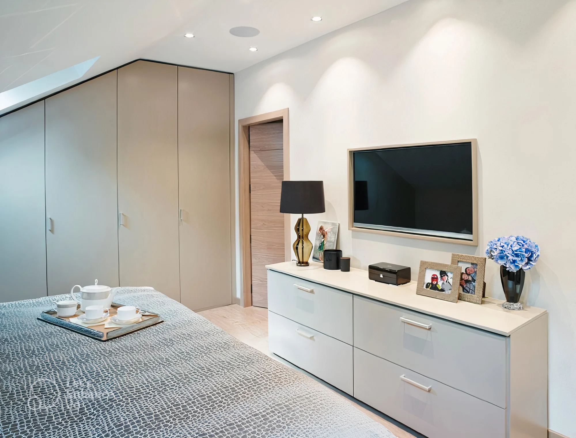
II
Westminster Apartment
Parliament View · SW1
III
Harrods Court
Knightsbridge · SW1
19
Type-First / Kinetic
Typography at 110px owns the left half of the viewport — the image is secondary. The scrolling ticker header (common in streetwear and music brand sites) adds kinetic energy completely absent from the interiors category. The word "Interiors" is broken across three lines with italic emphasis on "ter" — a typographic decision that functions as a visual argument about attention and craft.
FontCormorant Garamond 300 at 110px — monumental scale. Montserrat 200 for supporting UI.
Layout50/50 split. Left: ticker + mega type + nav. Right: full-height photography. Vertical tension.
Palette#f8f5f0 warm off-white, #1a1a1a, #9a8878 muted rose-brown italic accent
ToneBold and assured. The type speaks first. "View the work →" is the only CTA — it earns that brevity.
TacticCategory disruption through typographic scale. Memorable on first visit.
UXKinetic ticker creates motion without animation complexity. Type hierarchy is the navigation.
Volck Interiors · London Chelsea Penthouse · Westminster Apartment · Hamilton Terrace · Coombe Hill · Harrods Court · Broadley Street Volck Interiors · London Chelsea Penthouse · Westminster Apartment · Hamilton Terrace · Coombe Hill · Harrods Court · Broadley Street
Volck
In
ter
iors.
Projects
About
Contact
View the work →
20
Scrapbook / Collage
Deliberately rejects the polished grid in favour of something that feels assembled by hand. Slightly rotated photos with drop shadows, overlapping compositions, Fraunces italic at featherweight. Feels like a studio mood board rather than a corporate website. The warmest and most personal direction of all 20 — and paradoxically, one of the most distinctive precisely because nothing in luxury interiors looks like this.
FontFraunces 100 italic — variable "wonky" serif designed to feel imperfect. DM Sans 300 body.
LayoutAbsolutely positioned overlapping rotated images. Text floated top-right. No grid.
Palette#f0ebe2 aged paper, #2d2318 deep warm brown, #bba990 dusty taupe accent
ToneIntimate and joyful. "Spaces that feel like they were made for you — because they were." Human warmth.
TacticAnti-corporate positioning. For clients who want a relationship with their designer, not a transaction.
UXTactile, unhurried. Feels like picking up a portfolio on a studio visit. Curiosity-driven browsing.
Spaces that feel like they were made for you — because they were.
Volck creates bespoke residential interiors. London and beyond.
Explore the portfolio →